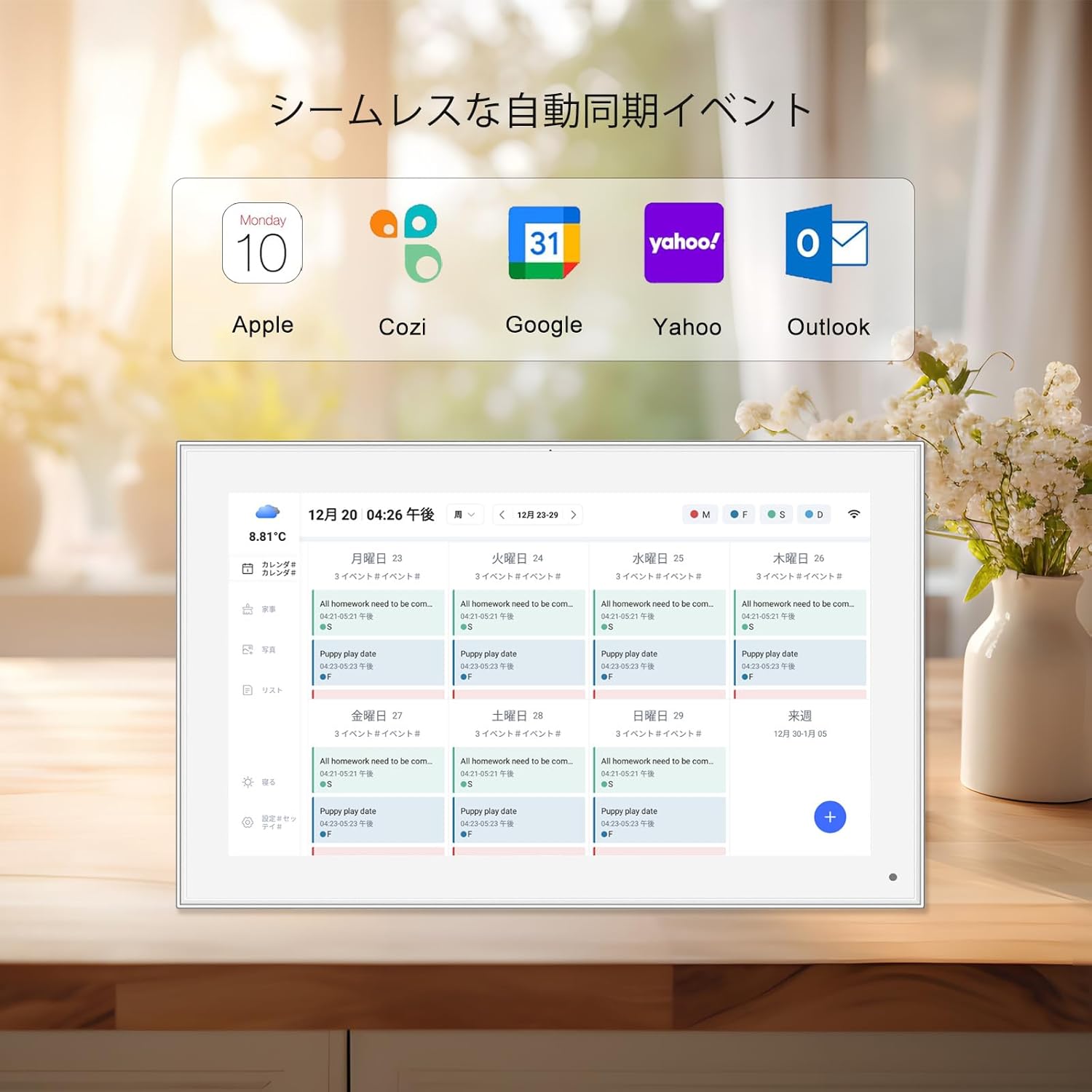
From the moment we wake up to the second we settle in for the night, screens surround us. Maybe you start your day by glancing at a frameo cloud frame on the kitchen counter, smiling at a photo of your grandkids sent the night before. Later, you hook up a 24.5 inch portable monitor to your laptop to tackle spreadsheets, or pass by a floor standing digital signage in the grocery store advertising this week's deals. Even your child's kids tablet lights up with cartoons during lunch. These moments seem simple, but behind each clear image, vibrant video, or sharp text lies a hidden pair of heroes: resolution and aspect ratio. Get them right, and your screen experience feels seamless—photos look lifelike, videos play smoothly, and text is easy to read. Get them wrong, and you're stuck with stretched faces, blurry fonts, or black bars eating up screen space. This guide will break down what resolution and aspect ratio really mean, why they matter for everyday devices, and how to match them perfectly for any screen.
Let's start with resolution—the "sharpness" factor of your screen. At its core, resolution refers to the number of pixels (tiny dots of color) packed into a display. Think of pixels as the individual tiles in a mosaic: the more tiles you have, the more detailed the picture. A screen's resolution is measured by its width and height in pixels, written as "width x height." For example, a common resolution is 1920x1080, which means 1,920 pixels across the width and 1,080 pixels down the height. Multiply those numbers, and you get the total pixels: 2,073,600—also known as "1080p" or "Full HD."
Why does this matter? More pixels mean finer details. A 10.1 inch led digital photo frame with a 1920x1080 resolution will show the wrinkles in your mom's smile or the texture of a birthday cake frosting more clearly than one with a lower resolution, like 1280x800 (720p). But resolution isn't just about "more is better"—it also depends on screen size. A 4K resolution (3840x2160) on a 10-inch tablet might look stunning, but on a 5-inch 3.5 inch screen kids digital camera display, the human eye can barely tell the difference from 1080p. That's because pixel density (pixels per inch, or PPI) matters too: smaller screens with high resolution have higher PPI, making images sharper.
Common resolutions you'll encounter:
If resolution is about detail, aspect ratio is about shape . Aspect ratio is the proportional relationship between a screen's width and height, written as "width:height" (e.g., 16:9). It determines whether the screen is wide and short, tall and narrow, or nearly square. Imagine baking a cake: resolution is how many sprinkles you put on top (more = more detail), while aspect ratio is the pan shape—round, square, or rectangular. Just as a square cake pan won't fit a rectangular recipe, a mismatched aspect ratio can ruin how content looks on your screen.
Let's break down the most common aspect ratios and where you'll find them:
| Aspect Ratio | Shape | Common Uses | Why It Works There |
|---|---|---|---|
| 16:9 | Widescreen (rectangular, wider than tall) | Portable monitors , digital signage , TVs, most kids tablets | Mimics movie theater screens; ideal for videos, gaming, and multitasking (e.g., splitting a 24.5 inch portable monitor into two windows). |
| 4:3 | Traditional (more square) | Older TVs, some digital photo frames (e.g., 19 inch wifi digital photo frame 4:3 screen ), medical monitors | Matches classic photography and document sizes (think old family photos or PDFs), avoiding cropping off heads or text. |
| 1:1 | Square | Social media displays, some smart home hubs | Perfect for Instagram or Facebook photos, which are often square; keeps content centered without black bars. |
| 21:9 | Ultrawide (very wide, narrow height) | High-end gaming monitors, professional video editing screens | Immersive for movies shot in "cinemascope" ratio; gives extra width for timelines or code editors. |
Here's why aspect ratio trips people up: most content (photos, videos, apps) is created for a specific ratio. If your screen's ratio doesn't match, the content has to adapt—and it's rarely pretty. For example, a 16:9 video played on a 4:3 wifi digital photo frame will either stretch horizontally (making people look like they're squashed) or add black bars top and bottom (wasting screen space). Similarly, a 4:3 photo (like a Polaroid) displayed on a 16:9 kids tablet will have black bars on the sides or get cropped, cutting off Aunt Mabel's shoulder.
Let's get practical. What happens when resolution and aspect ratio don't play nice? Let's walk through three common scenarios:
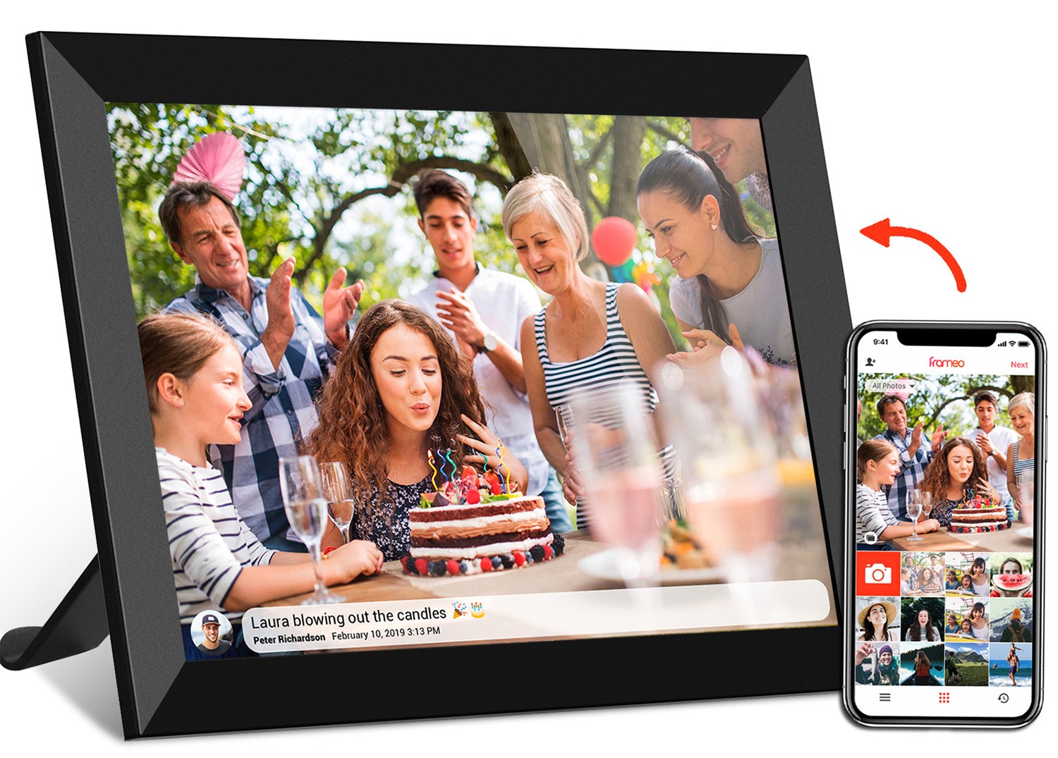
Your grandma just got a 10.1 inch frameo wifi digital photo frame for her birthday, and you're sending her photos from your phone. But when she checks, everyone's faces look stretched—like they've been pulled sideways. What's going on? Chances are, your phone takes photos in 16:9 aspect ratio (the default for most smartphones), but Grandma's frame has a 4:3 screen (common in frames designed for older photos). The frame is trying to "fill" the screen, so it stretches the 16:9 photo to fit the 4:3 shape, warping the image.
Fix: Most frameo wifi digital photo frame models have a "fit" or "letterbox" setting in the menu. Switching from "fill" to "fit" will add small black bars on the sides of the photo, keeping faces natural. Alternatively, crop your photos to 4:3 before sending—apps like Google Photos or Photoshop Express make this easy.
You just unboxed a hy300 pro+ portable monitor (2560x1440 resolution, 16:9 aspect ratio) to use with your laptop, but when you connect them, the text in your email app is fuzzy. Your laptop has a 1080p screen (1920x1080), so why the blur? The issue is resolution mismatch: your laptop is sending a 1080p signal to a 2K monitor. The monitor has to "upscale" the lower-resolution image to fill its higher-resolution screen, which can make edges look soft.
Fix: Adjust your laptop's display settings to match the monitor's native resolution (2560x1440). On Windows, go to "Display Settings" > "Resolution"; on Mac, "System Preferences" > "Displays" > "Scaled" and select the monitor's recommended resolution. This ensures the monitor uses all its pixels, making text sharp again.
A local café invested in a 43 inch commercial digital signage screen (16:9 aspect ratio) to show daily specials. But when they upload their ad video (shot on a 4:3 camera), the bottom of the text ("$5 Lattes!") gets chopped off. The issue? The video's 4:3 aspect ratio is taller than the screen's 16:9 ratio, so the signage is cropping the top and bottom to fill the width.
Fix: Reshoot the ad in 16:9, or use video editing software (like Canva or iMovie) to add black bars to the top and bottom of the 4:3 video, turning it into a "letterboxed" 16:9 video. This way, the entire ad fits without cropping.
Different devices have different "sweet spots" for resolution and aspect ratio. Let's break down the most common gadgets and how to choose (or adjust) specs for the best results.
A wifi digital photo frame is all about displaying photos, so resolution and aspect ratio here directly impact how your memories look. For small frames (7-10 inches), 1080p (1920x1080) is more than enough—any higher, and the difference is hard to spot unless you're holding the frame inches from your face. Larger frames (15.6 inches and up, like the 21.5 inch wifi digital picture frame frameo with touch ) benefit from 4K resolution, especially if you'll display group photos with lots of detail.
Aspect ratio depends on your photo collection:
Portable monitors (like the 24.5 inch portable monitor or hy300 pro+ ) are workhorses, used for everything from coding to streaming. Here, 16:9 aspect ratio is king—it's wide enough to split into two windows (e.g., Excel on one side, email on the other) and perfect for watching movies during breaks. Resolution-wise, 1080p is great for 13-15 inch monitors, while 2K (2560x1440) shines on 17-24 inch models. Avoid 720p unless you're on a tight budget—text will look grainy for work.
Pro tip: If you use your monitor for gaming or video editing, check the "refresh rate" (measured in Hz) too—a higher refresh rate (120Hz vs. 60Hz) makes motion smoother, but it pairs best with a resolution your laptop/console can handle (e.g., a 1080p/120Hz monitor works better with a mid-range laptop than a 4K/60Hz one, which may lag).
Digital signage (think floor standing digital signage in malls or poe meeting room digital signage in offices) needs to be seen from far away, so brightness and resolution matter most. For screens viewed up close (e.g., a 10.1 inch meeting room digital signage on a table), 1080p is fine. For large, distant screens (e.g., 43 inch commercial digital signage in a store), 4K resolution ensures text like "SALE 50% OFF" stays sharp even from 20 feet away.
Aspect ratio for signage depends on content:
A kids tablet needs to balance durability (those tiny hands drop things!) with clarity for cartoons and educational apps. Most kids' tablets (e.g., ssa 7 inch android kids tablet ) have 1080p resolution (1920x1080) and 16:9 aspect ratio—perfect for streaming Netflix or playing games. Avoid lower resolutions (720p) here: kids are surprisingly picky about blurry images, and many educational apps have detailed graphics that need sharpness. Also, look for "blue light filter" settings to protect little eyes during long use.
Even with the best planning, screen issues pop up. Here's how to solve the most frustrating ones:
Black bars happen when content aspect ratio doesn't match the screen. For example, a 4:3 photo on a 16:9 portable monitor will have bars on the sides. Fix: If you hate bars, crop the content to match the screen's ratio (e.g., crop a 4:3 photo to 16:9) or use the screen's "zoom" setting (note: this may cut off edges of the content).
A 4K 21.5 inch wifi digital photo frame or monitor has tiny pixels, which can make text hard to read. Fix: Adjust the "scaling" setting in your device's display options. On Windows, go to "Display Settings" > "Scale" and increase from 100% to 125% or 150%. On Mac, "System Preferences" > "Displays" > "Scaled" and choose a larger text option (e.g., "More Space" vs. "Larger Text").
If your floor standing digital signage stutters during video playback, the resolution might be too high for the device's processor. Fix: Lower the video resolution to match the signage's native resolution (e.g., if the sign is 1080p, convert the video from 4K to 1080p using tools like HandBrake). Most signage players can't handle 4K smoothly unless they're high-end models.
Resolution and aspect ratio might sound like tech jargon, but they're the unsung heroes of great screen experiences. Whether you're curating photos for a frameo cloud frame , setting up a 24.5 inch portable monitor for work, or designing ads for digital signage , understanding these two concepts ensures your content looks its best. Remember: resolution is about clarity (pixels), aspect ratio is about shape (width:height), and matching them means no more stretched faces, blurry text, or wasted screen space.
So the next time you're shopping for a wifi digital photo frame or troubleshooting a fuzzy monitor, take a second to check the specs. Your eyes (and your memories, spreadsheets, or customers) will thank you. After all, in a world of screens, the best ones are the ones you don't notice—because they just work.