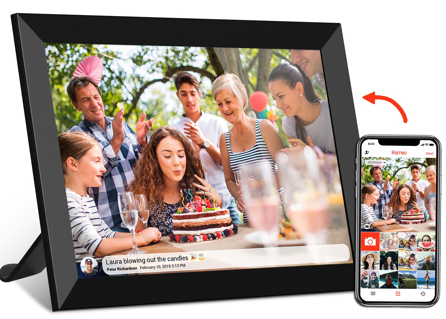
Picture this: You've just received a sleek new frameo wifi digital photo frame 10.1 inch as a gift. Eager to set it up, you scan the box for instructions and find a QR code linking to a video manual. You tap play, and suddenly, the narrator's face is stretched wide, like a funhouse mirror, and the text explaining how to connect to Wi-Fi is so squashed vertically that you can barely read the words "Frameo app." Frustrated, you wonder: "Did I get a defective frame? Or is something wrong with the video?" Chances are, the culprit isn't the frame at all—it's aspect ratio. That tiny, often overlooked number (like 16:9 or 4:3) that defines a screen's width and height relationship is quietly ruining your experience. In this article, we'll dive deep into why aspect ratio matters for video manuals, how it impacts devices from portable monitors to digital signage , and how to ensure your next video manual looks crisp, clear, and professional—no stretching required.
Let's start with the basics. Aspect ratio is simply the proportional relationship between a display's width and height, expressed as two numbers separated by a colon (e.g., 16:9). The first number represents width, the second height. So, a 16:9 screen is 16 units wide for every 9 units tall, while a 4:3 screen is 4 units wide for every 3 units tall. It's not about the actual size of the screen— a 24-inch monitor and a 10-inch tablet can both have a 16:9 aspect ratio, even though their physical dimensions differ. What matters is the shape , not the size.
Aspect ratio isn't new. Back in the days of CRT TVs, 4:3 was king—it mimicked the aspect ratio of film at the time, and for decades, it was the standard for everything from home TVs to computer monitors. But as technology evolved, so did our screens. Today, 16:9 dominates most modern displays, from laptops and smartphones to digital signage like floor standing digital signage in shopping malls. Why? Because it's wide enough to show movies and videos without huge black bars (hello, cinematic experience!) while still fitting comfortably on desks and walls. But here's the catch: not every device uses 16:9. Some, like older computer monitors or specialized displays (we're looking at you, 19 inch wifi digital photo frame 4:3 screen ), stick to 4:3. Others, like certain kids tablets designed for educational apps, might even use 1:1 (square) for better app compatibility. And if your video manual isn't tailored to the specific aspect ratio of the device it's meant for? Cue the distortion.
Video manuals are all about clarity. They exist to guide users through setup, troubleshooting, or feature exploration—tasks that require precise visuals. Imagine trying to follow a tutorial for a 24.5 inch portable monitor where the step showing how to adjust the brightness is cropped because the video was shot in 16:9 but the monitor's screen is 21:9 (ultrawide). You'd miss the button location entirely! Or consider a kids tablet with a 10.1-inch screen: if the video manual uses a 4:3 ratio but the tablet's display is 16:9, the animated characters explaining "how to take a photo" might look squashed, confusing little ones. Aspect ratio isn't just about aesthetics—it directly impacts usability. Get it right, and users feel confident and in control. Get it wrong, and they'll abandon the manual, flood customer support with calls, or worse, return the product.
Let's break down the real-world consequences. For manufacturers, a poorly optimized video manual can mean higher return rates, lower customer satisfaction, and a damaged brand reputation. For users, it's frustration and wasted time. Take the frameo wifi digital photo frame example again: if the video manual is stretched, users might assume the frame itself has a faulty display, even if the hardware is perfect. They might leave negative reviews like, "Screen is distorted—don't buy!" when the issue is purely a mismatch between the video's aspect ratio and the frame's screen. In short, aspect ratio is the silent bridge between your product and your customer. Build it well, and the path to adoption is smooth. Ignore it, and the bridge collapses.
Not all aspect ratios are created equal. Each has its own history, best use cases, and potential pitfalls for video manuals. Let's explore the most common ones you'll encounter in today's devices, from digital photo frames to commercial signage.
Chances are, most of the screens you interact with daily—your laptop, smartphone, TV, and even that floor standing digital signage at the grocery store—use 16:9. This ratio (16 units wide by 9 units tall) has become the global standard for video content, and for good reason: it strikes a balance between width (great for movies and multitasking) and height (still readable for text). For video manuals, 16:9 is a safe bet for most modern devices, including 10.1 inch wireless wifi digital photo frame models, 21.5 inch wifi digital picture frame frameo with touch , and even android tablet digital signage . It's versatile, widely supported, and matches the aspect ratio of most cameras, making it easy to shoot and edit.
But 16:9 isn't perfect. If you're creating a video manual for a device with a non-16:9 screen (like a 4:3 digital photo frame), using 16:9 will result in "pillarboxing"—black bars on the left and right sides of the screen—to fit the content. While better than stretching, these bars can make the video feel small and unprofessional, especially on smaller screens like a 7-inch kids tablet .
Before 16:9 took over, 4:3 was king. Think old CRT TVs, early computer monitors, and even some digital photo frames designed to mimic traditional printed photos (which are often 4:3 or 5:4). Today, you'll still find 4:3 in specialized devices, like the 19 inch wifi digital photo frame 4:3 screen —a popular choice for displaying family photos because it matches the aspect ratio of many smartphone cameras (before wide-angle lenses became mainstream). For video manuals, 4:3 is ideal if the target device has a 4:3 screen. It fills the display completely, eliminating black bars and ensuring text and images are neither stretched nor cropped.
However, 4:3 can feel outdated on modern 16:9 screens. If you shoot a video manual in 4:3 for a 16:9 digital signage display, you'll get "letterboxing"—black bars at the top and bottom. While not as distracting as stretching, it wastes screen space, making the manual feel less engaging. For example, a 21.5 inch digital signage display in a retail store using a 4:3 video manual would have large black bars, reducing the impact of promotional content.
Square (1:1) aspect ratio has surged in popularity thanks to social media platforms like Instagram and TikTok, where square videos fill the screen without cropping. While less common in traditional devices, it's finding a niche in kids tablets and educational displays, where apps and games are often optimized for square or vertical (9:16) layouts. For video manuals targeting younger users, 1:1 can be effective—square videos feel familiar (like the videos they watch on tablets) and are easy to focus on. Imagine a 3.5 inch screen kids digital camera with a video manual shot in 1:1: the close-up of the shutter button and the animated guide would fill the tiny screen perfectly, keeping little hands from getting confused.
The downside? 1:1 is rarely used in larger displays like portable monitors or digital signage , so videos shot in this ratio will have thick black bars on the sides or top/bottom when viewed on those devices.
Ultrawide (21:9) is the new kid on the block, popular in gaming monitors, high-end portable monitors , and some digital signage setups where immersive content is key. With its extra width, 21:9 is great for multitasking (think side-by-side windows) and cinematic videos. However, it's a niche ratio, so video manuals for 21:9 devices are rare. If you do need to create one, shooting in 21:9 ensures the content fills the screen, but be cautious: most editing software and cameras default to 16:9, so you'll need specialized tools. Plus, 21:9 videos look severely cropped on 16:9 or 4:3 screens, making them impractical for multi-device manuals.
Now that we've covered the "what" and "why," let's get practical. Different devices have different aspect ratios, and your video manual should match the device it's intended for. Below is a breakdown of common devices, their typical aspect ratios, and best practices for video manuals.
| Device Type | Common Aspect Ratio(s) | Best Video Manual Ratio | Potential Pitfalls to Avoid |
|---|---|---|---|
| Digital Photo Frames (e.g., Frameo Wifi Models) | 16:9 (most modern), 4:3 (classic photo-style) | Match the frame's ratio (e.g., 4:3 for 19 inch 4:3 screen) | Stretching 16:9 content to fit 4:3 screens; text becomes unreadable. |
| Portable Monitors (e.g., 24.5 inch) | 16:9 (standard), 21:9 (ultrawide) | 16:9 (most versatile) or 21:9 (if monitor is ultrawide) | Using 4:3 videos on 16:9 monitors; black bars reduce screen real estate. |
| Digital Signage (e.g., Floor Standing, Wall-Mounted) | 16:9 (most common), 9:16 (vertical/portrait) | 16:9 (landscape) or 9:16 (portrait, for vertical signage) | Mixing orientations (e.g., landscape video on portrait signage); content is cropped. |
| Kids Tablets (e.g., 7 inch, 10.1 inch) | 16:9 (standard), 1:1 (square, for apps) | 16:9 (matches most kids' content) or 1:1 (for app-focused manuals) | Squashing 16:9 videos into 1:1; characters/animations look distorted. |
| Meeting Room Digital Signage (e.g., POE Models) | 16:9 (widescreen for presentations) | 16:9 (matches presentation software like PowerPoint) | Using 4:3 videos; text in slides becomes tiny on 16:9 screens. |
Let's put this into practice with a real device: the frameo wifi digital photo frame 10.1 inch , a popular model with a 16:9 screen. The manufacturer wants to create a video manual showing users how to: (1) connect to Wi-Fi, (2) upload photos via the Frameo app, and (3) adjust slideshow settings. Here's how they'd optimize the aspect ratio:
Result? A video manual that feels seamless, with clear visuals that guide users through setup without confusion. No more squashed faces or unreadable text—just a smooth experience that makes the frame feel user-friendly and well-designed.
Now, consider the 19 inch wifi digital photo frame 4:3 screen , designed for users who prefer the classic photo aspect ratio. For this device, a 16:9 video manual would result in pillarboxing (black bars on the sides), making the content feel small. Instead, the manufacturer should shoot in 4:3. They'd also need to adjust their approach to visuals: since 4:3 is taller than 16:9, vertical content (like scrolling through the photo gallery) will be easier to show, but wide shots (like comparing multiple photos) might need to be split into separate frames to avoid overcrowding.
Even with careful planning, aspect ratio issues can creep in. Let's troubleshoot the most common problems and how to fix them.
This is the most obvious issue. If your video looks like it's been run through a funhouse mirror, the aspect ratio of the video doesn't match the device's screen. For example, a 4:3 video played on a 16:9 portable monitor might be stretched horizontally to fill the screen, making circles look like ovals. Fix: Reshoot the video in the device's native ratio, or use editing software to add black bars (pillarboxing/letterboxing) instead of stretching. While black bars aren't ideal, they're better than distortion.
If parts of the video are cut off (e.g., the "Upload" button in a photo frame manual is missing), the video was shot in a ratio with a wider or taller aspect than the device's screen. For example, a 21:9 ultrawide video played on a 16:9 digital signage display will crop the left and right edges. Fix: Use "letterboxing" (add black bars top/bottom) to fit the entire video, or reframe the shot to keep key elements (buttons, text) in the center of the screen (the "safe zone"). Most editing tools have guides to help you avoid cropping critical content.
You shot a video in 16:9 for a 21.5-inch wifi digital picture frame , but the text explaining "how to delete a photo" is so small it's unreadable. Why? Aspect ratio isn't just about width and height—it's also about pixel density. A 10.1-inch screen and a 21.5-inch screen might both be 16:9, but the larger screen has more pixels, so text needs to be bigger. Fix: Increase font size in the video, or use close-up shots of text-heavy elements. For example, zoom in on the "delete" button instead of showing the entire frame.
As displays evolve, so will aspect ratios. Foldable phones and tablets with adjustable screens (like the incell portable smart tv with flexible displays) are already blurring the lines between 16:9, 4:3, and even 21:9. For video manuals, this means adaptability will be key. Manufacturers may need to create "responsive" video manuals that adjust their aspect ratio based on the device—similar to how websites adapt to different screen sizes. Until then, the best approach is to know your device, test your video on the actual hardware, and prioritize clarity over cutting-edge ratios. After all, a video manual's job is to teach, not to showcase the latest display technology.
Aspect ratio might seem like a technical detail, but it's the foundation of a great video manual. Whether you're explaining how to use a kids tablet , set up a portable monitor , or upload photos to a frameo wifi digital photo frame , getting the aspect ratio right ensures your content is clear, professional, and easy to follow. It shows users you care about their experience—and that attention to detail can turn first-time buyers into loyal customers. So, the next time you hit "record" on a video manual, ask: "What's the aspect ratio of the device this is for?" Your users (and your customer support team) will thank you.