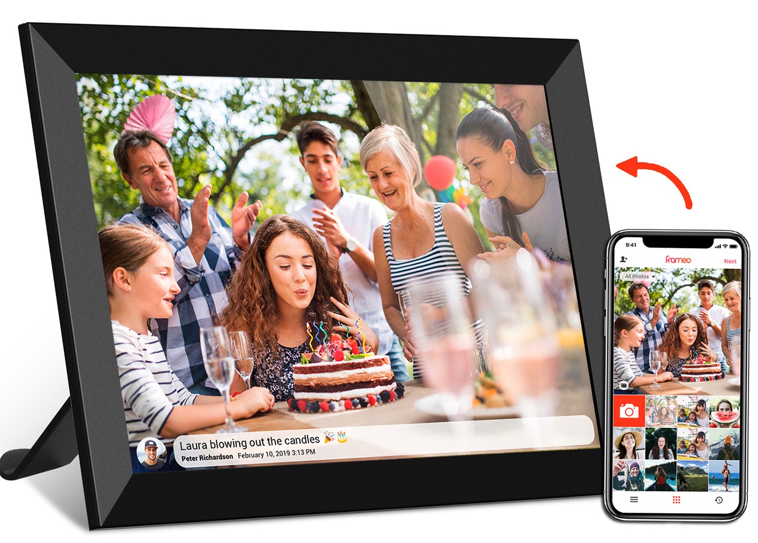
If you've ever tried to follow a video manual for a new gadget—whether it's a sleek digital photo frame that's supposed to display family photos effortlessly or a quirky video brochure that plays a demo when you open it—you know how frustrating a poorly designed video can be. Maybe the text was too small, or the buttons you were supposed to press got cut off at the edges. Chances are, the culprit wasn't just bad editing: it might have been the aspect ratio . That's the invisible grid that shapes how your video fits on a screen, and getting it right can turn a confusing manual into one that feels like a helpful friend guiding you through setup. Let's dive into why aspect ratio matters and how to nail it for your next video manual, with real-world examples from products like frameo cloud frames , portable monitors , and more.
Aspect ratio is simply the proportion of a screen's width to its height. Think of it as the "shape" of the display. A square screen might be 1:1 (width equals height), while a widescreen TV is usually 16:9 (16 units wide for every 9 units tall). Seems simple, right? But here's the catch: if your video manual's aspect ratio doesn't match the device your audience is using, chaos ensues. Black bars might creep in at the top and bottom (letterboxing) or sides (pillarboxing), making your content feel tiny. Or worse, important details—like the "connect to Wi-Fi" button on a frameo cloud frame —could get cropped out entirely. When users can't see what you're talking about, they get frustrated, and that's bad news for your product's reputation.
Take video brochures , for example. These handy marketing tools are often small—think 5-inch or 7-inch screens—and foldable, which means their aspect ratios are often more square or tall than wide. If you film a video manual for a 5-inch video brochure using the standard 16:9 widescreen ratio, you'll end up with massive black bars on the top and bottom, shrinking your actual content to a fraction of the screen. Users squinting to read text like "Press the power button for 3 seconds" aren't going to stick around. On the flip side, a portable monitor —say a 24.5-inch model meant for laptops—thrives on widescreen ratios like 16:9 or 16:10, where extra width lets you show side-by-side steps (e.g., "Here's the menu on the left, and the settings you need on the right").
The bottom line? Aspect ratio isn't just about aesthetics. It's about respect for your audience's time and patience. Get it right, and your video manual becomes a tool that makes users think, "Wow, this is easy!" Get it wrong, and they'll be reaching for the return form. Let's break down the key tips to get it right.
This might sound obvious, but you'd be surprised how many video manuals are shot in 16:9 "because that's what everyone uses" without considering the actual device they're meant for. The first rule of aspect ratio design is: match the ratio to the screen your audience will use most . Let's break down common devices and their typical aspect ratios to make this concrete.
| Device Type | Common Aspect Ratios | Why It Matters | Example Product |
|---|---|---|---|
| Digital Photo Frame | 16:10, 4:3, 1:1 | Older frames often use 4:3 (like printed photos); newer ones use 16:10 for widescreen shots. | 10.1 inch Frameo Wifi Digital Photo Frame |
| Video Brochure | 3:2, 4:3, 5:4 | Small, foldable screens need compact ratios to fit text and buttons without cropping. | 5 inch Video Brochure |
| Portable Monitor | 16:9, 16:10, 3:2 | Widescreen ratios work best for multitasking and viewing large content. | 24.5 inch Portable Monitor |
| Digital Signage | 16:9, 9:16 (vertical), 21:9 | Vertical 9:16 is popular for narrow spaces like lobbies; 16:9 for standard displays. | 21.5 inch Wifi Digital Signage |
| Kids Tablet | 16:10, 4:3 | 16:10 balances game/app visibility with easy (holding) for small hands. | 10.1 inch Kids Tablet PC |
Let's take the 10.1 inch Frameo Wifi Digital Photo Frame as an example. Most modern digital photo frames in this size use a 16:10 aspect ratio. Why? Because it's wide enough to display landscape photos nicely but not so wide that portrait photos get tiny black bars. If you film a video manual for this frame in 16:9 (the ratio of most TVs), your video will have thin black bars at the top and bottom. That might not seem like a big deal, but when you're trying to show users how to swipe between photos or adjust brightness, those bars shrink the usable space. Suddenly, the "Settings" icon you're pointing to looks half its size, and users are squinting to follow along.
On the flip side, video brochures are often small and square-ish. A 5 inch video brochure might use a 4:3 ratio—think old-school TV—because it needs to fit text like "Press here to play" and a small video window without cramming. If you force 16:9 here, you'll end up with thick black bars on the sides, making the text unreadable. Users won't bother squinting; they'll just toss the brochure aside.
So, step one: Grab the device your manual is for (or a spec sheet) and note its aspect ratio. If it's a portable monitor like the 24.5 inch model, check if it's 16:9 or 16:10. If it's a digital signage screen in a lobby, find out if it's mounted vertically (9:16) or horizontally (16:9). Your video should fit that shape like a glove.
It's tempting to shoot everything in 16:9 because "that's what YouTube uses" or 21:9 because it looks "cinematic." But here's the truth: aspect ratio should serve your content, not the other way around. If your video manual is heavy on text (like step-by-step instructions for a frameo cloud frame setup), a wider ratio might stretch the text too thin. If it's all about showing off a product's design (like a sleek portable monitor ), a wider ratio could make sense. Let's break down two common scenarios where content should drive your ratio choice.
Imagine you're creating a video manual for a 5 inch video brochure that explains how to use a new software tool. The video needs to show on-screen text like "Click 'File' > 'Save'" and close-ups of keyboard shortcuts. A 16:9 ratio here would mean the text is spread out horizontally, making each word tiny. Users might need to hold the brochure inches from their face to read it—not ideal. Instead, a 4:3 or 3:2 ratio condenses the width, letting you make text larger and easier to read. It might not look "modern," but it's usable —and usability is the whole point of a manual.
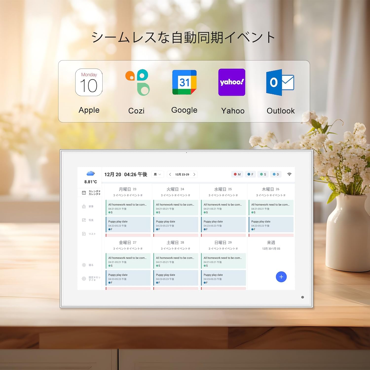
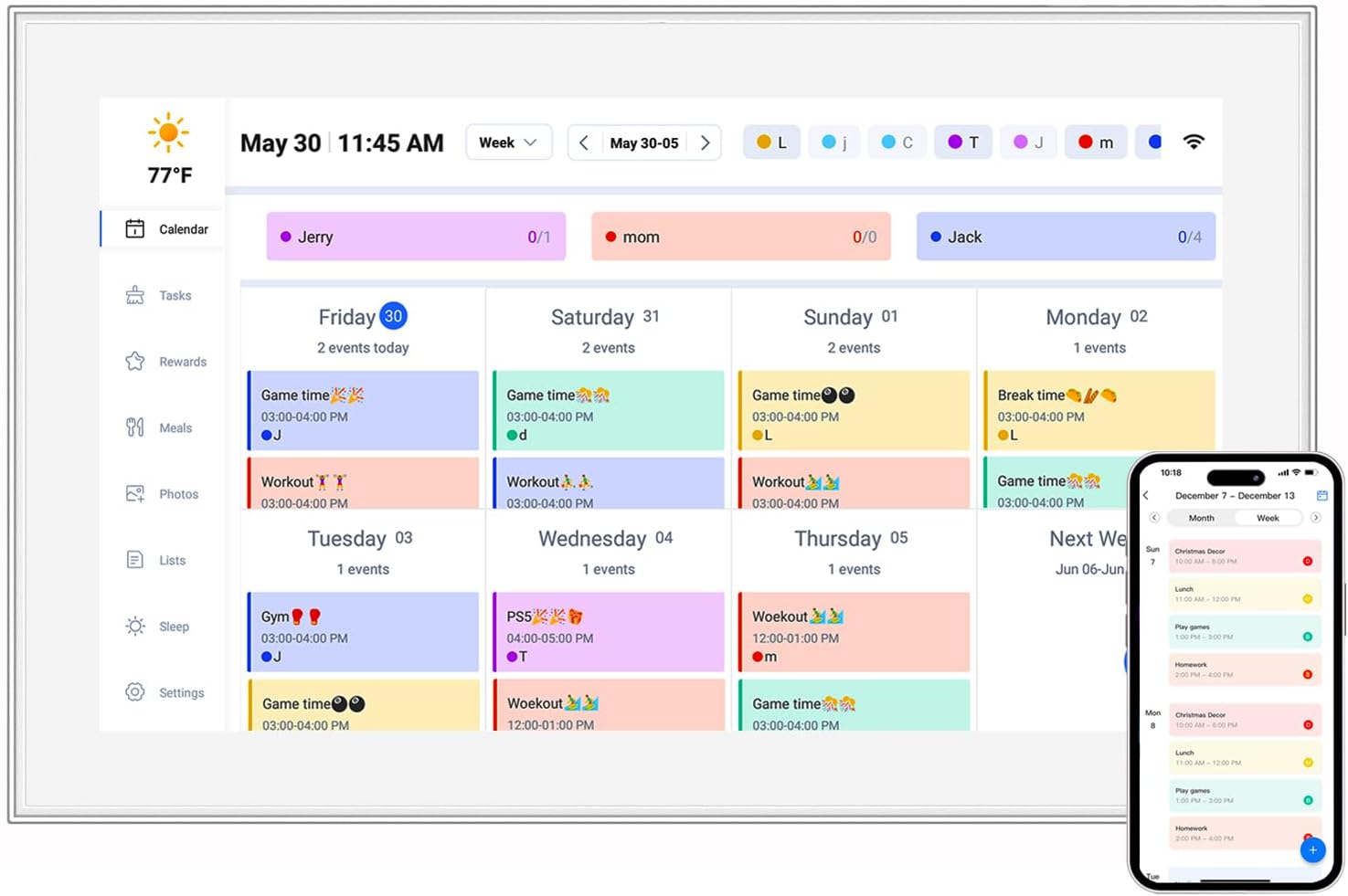
The same logic applies to digital calendar clocks (like the 15.6 inch digital calendar). These devices often display dates, times, and reminders in blocky text. A 4:3 screen (common for older TVs) gives more vertical space, so you can stack information without it feeling cramped. A 16:9 screen might force you to shrink the text to fit, turning "Monday, 3 PM: Dentist" into a blurry mess.
Now, if your manual is all about showing off visuals—like how a 10.1 inch Frameo Wifi Digital Photo Frame displays photos from your phone—wider ratios shine. A 16:10 ratio lets you show a full landscape photo without cropping, so users can see exactly how their images will look. Similarly, a 24.5 inch portable monitor manual might use 16:9 to demonstrate split-screen multitasking: half the screen for a document, half for a video. A square ratio here would make the split screens tiny and defeat the purpose of the monitor's size.
The key takeaway? Ask: "What's more important—how the video looks, or how well users can follow the steps?" 9 times out of 10, the answer is the latter. Trendy ratios can wait; clarity can't.
You've picked the perfect aspect ratio for your target device—say, 16:10 for a 10.1 inch frameo wifi digital photo frame . Done, right? Not quite. Here's a secret: users rarely watch video manuals only on the device itself. They might watch it on their phone while unboxing, or on their laptop before buying. If your video looks great on the frame but terrible on a phone, you've still failed.
Let's say your manual is for a 24.5 inch portable monitor with a 16:9 ratio. You film the entire video in 16:9, showing off the monitor's wide screen. But when a user watches this on their iPhone (which has a 19.5:9 ratio—even wider than 16:9), your video will have black bars on the top and bottom. The monitor demo will look tiny, and users might think, "Is this monitor really that small?" To fix this, add "safe zones" to your video: keep all important content (like text, buttons, or product features) within a central 4:3 area. That way, even if the video is viewed on a super-wide or super-tall screen, the key info stays visible.
Another example: digital signage for a retail store. You design a 16:9 video manual explaining how to update ads on a 21.5 inch wifi digital signage screen. But the store manager watches the manual on their vertical 9:16 phone screen. Without safe zones, your "update" button demo might get cut off the side. By keeping critical elements in the center, you ensure the manager can still follow along, even on a rotated screen.
Pro tip: Test your video on at least three devices before finalizing: the target device, a smartphone (both vertical and horizontal), and a laptop. Note where content gets cropped or squished, and adjust your aspect ratio or safe zones accordingly. It takes extra time, but it's worth it to avoid "Why can't I see the button?!" emails.
Aspect ratio isn't just about width and height—it's also about orientation : landscape (wider than tall) or portrait (taller than wide). This is especially important for devices like digital signage and kids tablets , where orientation can vary.
Most digital photo frames and portable monitors are used in landscape orientation. A 21.5 inch wifi digital picture frame with touch is designed to sit on a mantel, showing landscape photos of vacations or family gatherings. A video manual for this frame should also be in landscape, so users can see how the touch controls align with the screen's width. If you film it in portrait, the frame's interface will look squashed, and users won't understand how to swipe horizontally between photos.
Vertical digital signage—like the kind you see in elevator lobbies or retail store aisles—uses a 9:16 aspect ratio (portrait). A video manual for this should also be in portrait, showing how to upload tall images or scroll through vertical menus. If you use landscape, the video will have huge black bars on the sides, making the content feel lost.
Kids tablets are a wild card. Some are used in landscape (for games), others in portrait (for reading e-books). If you're making a manual for a 10.1 inch kids tablet pc , consider filming two versions: one landscape for gaming tips, one portrait for reading tips. Or, again, use safe zones to keep content visible in both orientations.
If you're creating a video manual that will be shared across multiple devices—say, on YouTube, your website, and included in the box as a video brochure —you might feel overwhelmed choosing a ratio. In this case, 16:9 is a safe default. It's the most common ratio for TVs, laptops, and phones (when held horizontally), so it will look decent across most screens. But remember the catch: use safe zones . Keep all text, buttons, and product features within a 4:3 area in the center. This way, even if the video is viewed on a 1:1 square screen or a 9:16 vertical screen, the critical info won't get cut off.
For example, a 10.1 inch frameo wifi digital photo frame private mold 6.0 might have a 16:10 screen, but its video manual is hosted on YouTube (16:9). By keeping the frame's setup steps in the center 4:3 area of the 16:9 video, users watching on YouTube (16:9) see the full demo, and users watching on the frame itself (16:10) don't miss any details either. It's a compromise, but it works when you can't tailor the video to a single device.
At the end of the day, aspect ratio design isn't about pleasing tech specs—it's about respecting your users. When you take the time to match the ratio to their device, prioritize clarity over trends, and test across screens, you're saying, "We care about making this easy for you." And that builds trust—whether you're selling a frameo cloud frame to a grandma who wants to see her grandkids' photos, or a portable monitor to a student juggling homework and Zoom calls.
So the next time you sit down to create a video manual, start with one question: "What will this look like through the user's eyes?" The answer will guide your aspect ratio choices, and your users will thank you for it—one clear, frustration-free setup at a time.