Walk into any modern café, office lobby, or even a family living room these days, and you're likely to encounter an acrylic interactive screen. Maybe it's an acrylic motion video frame by the counter, looping vibrant ads for seasonal drinks. Or perhaps a frameo wifi digital photo frame on the wall, displaying a rotating gallery of family photos sent wirelessly from across the country. In retail stores, android tablet digital signage might greet you at the entrance, showcasing promotions with sleek touch-responsive menus. These screens—sleek, lightweight, and often wrapped in glossy acrylic—have become silent storytellers, connecting brands, families, and communities through visual content.
But here's the thing: not all acrylic interactive screens work seamlessly. Ever noticed a video that looks stretched, with people appearing unnaturally tall? Or a photo that's cropped awkwardly, cutting off Aunt Mabel's head in the family portrait? Chances are, the culprit is a mismatch between the screen's aspect ratio and the system powering it. Aspect ratio—the proportional relationship between a screen's width and height—might seem like a minor technical detail, but it's the invisible hand that shapes how content looks, feels, and functions. And when it clashes with the software, hardware, or content management systems (CMS) driving the screen, the result is often a frustrating, unprofessional experience.
In this article, we'll dive into why aspect ratio design matters so much for acrylic interactive screens, how it intersects with system compatibility, and what happens when these two elements aren't in sync. We'll use real-world examples—from a small business owner struggling with their acrylic motion video frame to a family puzzling over their frameo wifi digital photo frame —to unpack the challenges and solutions. By the end, you'll understand how to choose, design, and optimize acrylic interactive screens so they don't just display content, but elevate it.
Before we get into aspect ratios and compatibility, let's clarify what we mean by "acrylic interactive screens." At their core, these are display devices built with acrylic—a lightweight, shatter-resistant plastic that's prized for its clarity and modern aesthetic—as the outer casing or frame. Unlike traditional glass screens, acrylic is easier to mold into unique shapes (think curved edges or custom cutouts) and often has a softer, more inviting look, making it ideal for spaces where design matters as much as functionality.
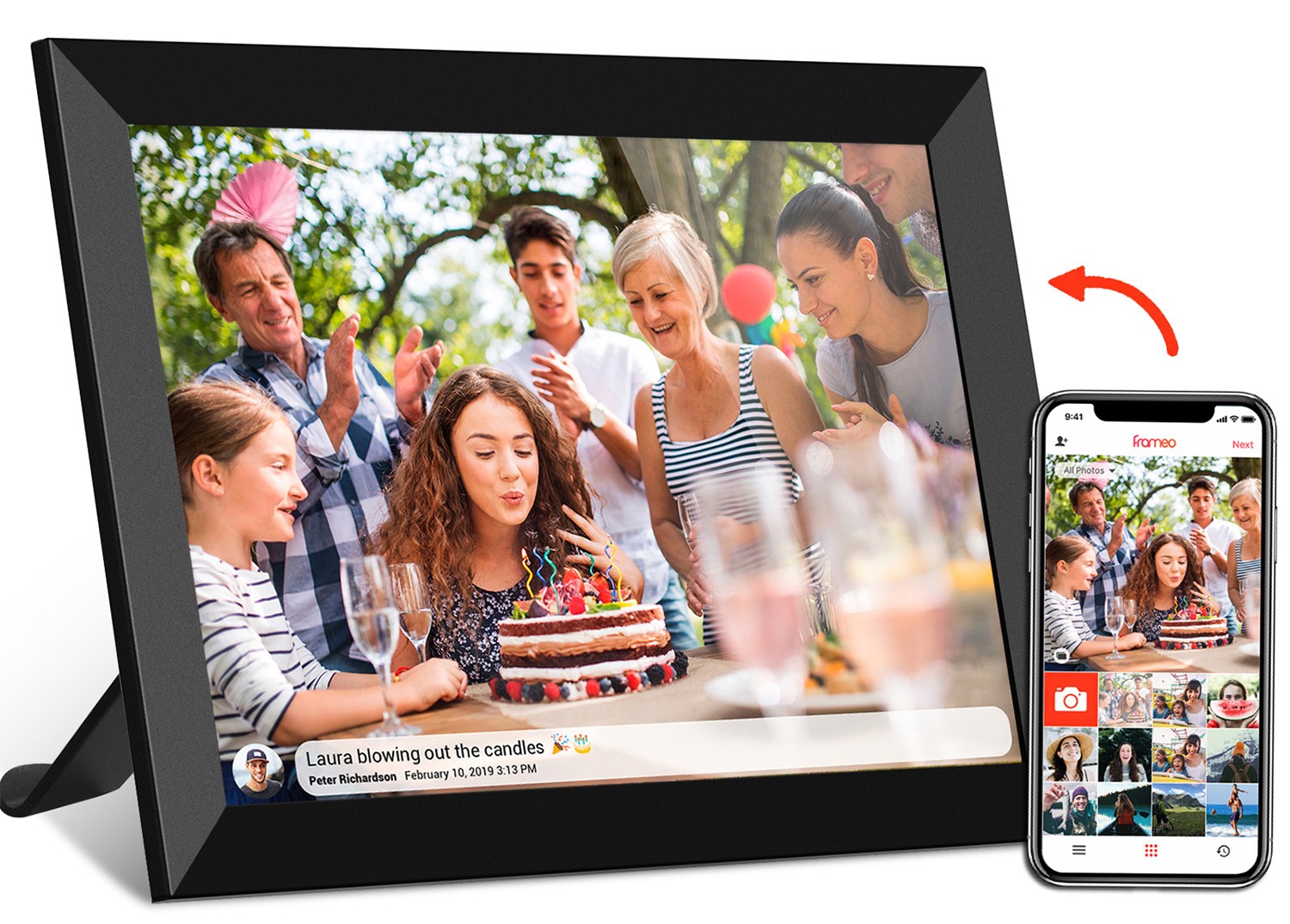
What makes them "interactive"? Most include touchscreens, motion sensors, or wireless connectivity, letting users engage with content directly. For example, an acrylic motion video frame in a boutique might pause a product video when a customer waves a hand near it, or a frameo wifi digital photo frame lets family members send photos via app, which instantly appear on the screen. In commercial settings, android tablet digital signage often comes with touchscreens, allowing customers to swipe through menus or check product availability.
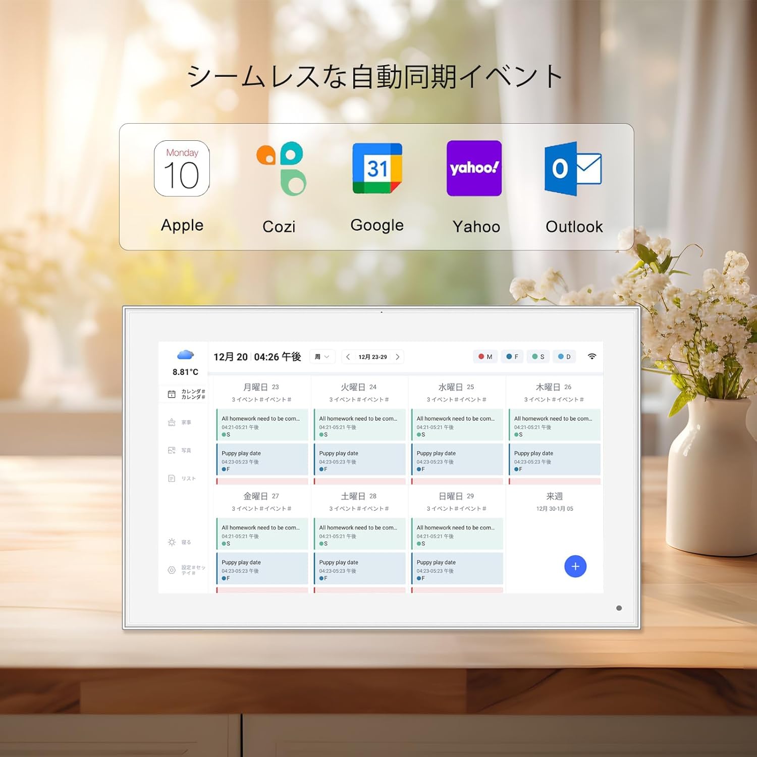
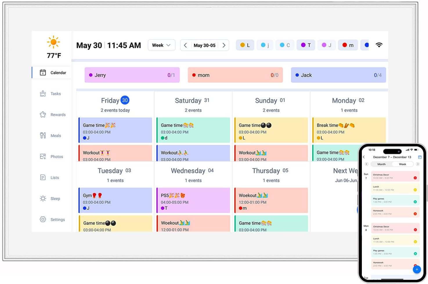
These screens come in all shapes and sizes, too. You'll find compact 7-inch models for desktops, 21.5-inch wall-mounted displays for lobbies, and even large-format open frame lcd display panels integrated into acrylic kiosks for public spaces. Some are designed for static content (like photos), others for dynamic videos or apps. But no matter the size or use case, one feature unites them all: their aspect ratio. And that's where the trouble often starts.
Let's start with the basics: aspect ratio is expressed as two numbers separated by a colon, like 4:3 or 16:9. The first number represents width, the second height. So a 4:3 screen is 4 units wide for every 3 units tall, while a 16:9 screen is 16 units wide for every 9 units tall. Seems simple, right? But these numbers dictate everything from how a movie fills the screen to how much text fits on a digital sign.
To visualize, think of a classic 4:3 screen—the kind you might remember from old CRT TVs or early computer monitors. It's nearly square, which made it great for documents, photos, and TV shows from the 20th century, which were mostly shot in 4:3. Then came 16:9, the "widescreen" ratio that dominates today's TVs, laptops, and phones. Designed to mimic the human field of view, 16:9 is perfect for movies (which often use even wider ratios like 21:9) and modern video content, as it minimizes those annoying black bars at the top and bottom of the screen.
But 4:3 and 16:9 aren't the only players. There's 1:1 (square), popular for social media content like Instagram posts; 3:2, common in tablets and some digital photo frames; and even specialty ratios like 5:4 for professional monitors. Each ratio evolved to serve a specific purpose: 4:3 for productivity, 16:9 for entertainment, 1:1 for social sharing. The problem? Acrylic interactive screens are often repurposed across contexts—an acrylic motion video frame meant for 16:9 ads might end up displaying 4:3 product photos, or a frameo wifi digital photo frame designed for 16:10 (a common tablet ratio) gets flooded with 1:1 smartphone snapshots.
Here's why this matters: content is created with a specific aspect ratio in mind. A photographer shooting family portraits might use a 3:2 camera sensor, a videographer filming a commercial might opt for 16:9, and a social media manager designing Instagram Reels will stick to 9:16 (vertical). When a screen's aspect ratio doesn't match the content, the system (the software or CMS running the screen) has to make a choice: stretch the content to fit (distorting it), crop it (losing parts), or add black bars (letterboxing/pillarboxing). None of these are ideal, but which one happens depends on the system's compatibility with the screen's ratio.
If aspect ratio is the "what" of screen design, system compatibility is the "how." A screen's system includes everything that makes it work: the operating system (OS) like Android or iOS, the hardware (chipsets, GPUs, touch controllers), the CMS (software that manages content), and even the apps or drivers that bridge the gap between content and display. For an acrylic interactive screen to work well, all these pieces need to "speak the same language" as the screen's aspect ratio.
Let's break down the key components of system compatibility:
The bottom line: system compatibility isn't just about "will the screen turn on?" It's about whether the entire ecosystem—OS, hardware, CMS, apps—can adapt to the screen's aspect ratio to deliver content that's clear, undistorted, and easy to interact with.
To understand the impact of a mismatch, let's walk through three common scenarios where aspect ratio and system compatibility collide. These aren't hypothetical—they're stories from small business owners, families, and IT managers I've spoken with over the years.
Maria owns a small café in downtown Portland. Last year, she invested in a sleek acrylic motion video frame (16:9, 21.5 inches) to display daily specials and promotions. She hired a local designer to create a 4:3 video ad for her new mango smoothie—bright, colorful, and featuring a close-up of the smoothie in a tall glass. When she uploaded the video to the frame's basic CMS (a cheap, off-the-shelf tool), she noticed something was wrong: the smoothie glass looked squat, the mango chunks stretched wide, and the text ("NEW! Mango Smoothie") was warped.
What happened? Maria's CMS didn't support aspect ratio adjustment. It simply stretched the 4:3 video to fill the 16:9 screen, distorting everything. The frame's OS (a basic Linux variant) had no scaling options, and the GPU was too underpowered to add black bars without lag. Frustrated, Maria tried cropping the video herself, but that cut off the top and bottom of the glass, making the ad look unprofessional. In the end, she had to pay the designer to re-shoot the video in 16:9—an unexpected expense that could have been avoided if she'd chosen a CMS compatible with mixed ratios.
Robert and Linda, empty nesters in Florida, received a frameo wifi digital photo frame (10.1 inches, 16:10 aspect ratio) as a gift from their kids. The frame was supposed to be "plug-and-play": download the Frameo app, send photos from phones, and they'd appear instantly. At first, it worked great—photos of the grandkids at the beach, birthdays, and holidays popped up with vibrant colors. But then Linda noticed something odd: vertical photos (taken in 9:16 on her daughter's iPhone) were being cropped on the sides, cutting off the grandkids' faces. Horizontal photos (16:9) had thin black bars at the top and bottom, which felt like wasted space.
After calling customer support, they learned the issue: the Frameo system (both the app and the frame's software) prioritized "fill mode" for vertical photos on 16:10 screens. Instead of letterboxing (adding black bars) or resizing, it cropped the sides to make the photo fit vertically. For horizontal 16:9 photos, the system added bars because 16:9 is slightly narrower than 16:10 (16:10 is 8:5, or 1.6; 16:9 is ~1.78). The Frameo app had no setting to change this behavior—so Robert and Linda were stuck choosing between cropped faces or black bars. "It's like the frame doesn't understand our photos," Linda sighed. "We wanted to see the grandkids, not just their foreheads!"
A tech startup in Austin installed android tablet digital signage (19 inches, 4:3 aspect ratio) in their meeting rooms. The goal: display schedules, room availability, and quick links to join Zoom calls via touchscreen. The tablets ran Android 11 and used a popular office CMS to manage content. But from day one, the screens lagged. When employees tapped "Join Meeting," there was a 2-second delay. When scrolling through the schedule, the text stuttered. The IT team checked the internet, updated the OS, and even replaced the tablets—nothing worked.
The root cause? The CMS was designed for 16:9 screens. When forced to run on 4:3 android tablet digital signage , it struggled to render the UI. Buttons and text boxes, optimized for wide screens, overlapped on the narrower 4:3 display, forcing the GPU to work overtime to redraw elements. The tablet's GPU, mid-range and optimized for 16:9, couldn't keep up, leading to lag. The solution? The startup switched to a CMS built for 4:3 enterprise displays, and the lag disappeared. But not before weeks of frustration and missed meetings.
To make this tangible, let's compare common aspect ratios, their typical use cases, and how they interact with different systems. This table summarizes the challenges and compatibility levels you might encounter with acrylic interactive screens:
| Aspect Ratio | Common Acrylic Screens | Typical Content | System Compatibility Challenges | Most Compatible Systems |
|---|---|---|---|---|
| 4:3 | Legacy open frame lcd display , some frameo wifi digital photo frames (older models) | Documents, older photos, medical imaging (in healthcare settings) | Modern OS/CMS often stretch or crop content; GPUs may lag with 16:9 apps | Enterprise CMS (e.g., for healthcare), older proprietary OS |
| 16:9 | Acrylic motion video frame , most android tablet digital signage , incell portable smart tv | Videos, movies, modern photos, social media content (landscape) | Vertical (9:16) content may have black bars; less common in square/vertical use cases | Android 10+, mainstream CMS (BrightSign, ScreenCloud), Frameo (newer models) |
| 16:10 | 10.1-inch frameo wifi digital photo frames , portable monitors | Mixed: photos, short videos, apps | 16:9 content has small top/bottom bars; 4:3 content may stretch | Frameo OS, Android with custom scaling, tablet-optimized CMS |
| 1:1 (Square) | Small acrylic motion video frames (e.g., 7-inch countertop displays) | Social media (Instagram, TikTok), product photos | Most OS/CMS treat as "uncommon," leading to cropping or forced scaling | Social media-focused CMS, custom proprietary systems |
The good news? Aspect ratio and system compatibility issues are solvable—with a little planning. Whether you're a business owner buying an acrylic motion video frame , a family choosing a frameo wifi digital photo frame , or an IT manager deploying android tablet digital signage , here's how to ensure harmony between ratio and system:
The biggest mistake people make is choosing a screen first, then trying to force content onto it. Instead, ask: What will this screen display most of the time? If it's family photos (many of which are vertical, 9:16, from phones), a 16:10 or 16:9 frameo wifi digital photo frame may work better than 4:3. If it's videos (almost always 16:9), an acrylic motion video frame with a 16:9 ratio is a no-brainer. For documents or older photos, 4:3 might still make sense—but only if your CMS supports it.
Pro tip: Audit your content. Collect 10-20 examples of what you'll display (photos, videos, docs) and note their aspect ratios. The screen's ratio should match the most common one. If you have a mix, prioritize the ratio that causes the least distortion (e.g., 16:9 for a mix of 16:9 and 9:16 content, as vertical content can letterbox without cropping).
Not all systems are created equal. When shopping for an acrylic interactive screen, look for OS/CMS that offer aspect ratio flexibility . For example:
There's no substitute for hands-on testing. If you're buying a screen for a business, ask the manufacturer for a demo unit. Load it with your actual content—photos, videos, apps—and see how it performs. For a frameo wifi digital photo frame , send a mix of vertical (9:16), horizontal (16:9), and square (1:1) photos to see how the system handles them. For android tablet digital signage , run the CMS with your typical schedule and apps to check for lag or UI glitches.
Robert and Linda, the empty nesters, wish they'd done this. "We just assumed 'wifi photo frame' meant it worked with all photos," Robert said. "If we'd tested with our daughter's vertical shots, we'd have picked a different model."
If you're unsure what content you'll display long-term, stick to the most common aspect ratio: 16:9. It's the standard for movies, TV, social media (landscape), and most modern apps. While it may not be perfect for every use case, it's the safest bet for compatibility with future content and systems. Avoid niche ratios like 5:4 or 3:2 unless you're certain your content and system can support them long-term.
As acrylic interactive screens become more advanced, the line between aspect ratio and system compatibility is blurring—for the better. Manufacturers are starting to build "smart" screens that adapt to content, not the other way around. For example, some acrylic motion video frames now use AI to analyze content and adjust the aspect ratio in real time: a 4:3 video might trigger the screen to "mask" the sides with decorative acrylic panels, turning it into a pseudo-4:3 display. Others are experimenting with flexible screens that can physically adjust their width and height (though these are still pricey).
On the software side, CMS platforms are moving toward "responsive design" for digital signage—content that automatically rearranges itself based on the screen's ratio, much like a website adapts to phone vs. desktop. Imagine a android tablet digital signage in a meeting room that, when switched from 16:9 to 4:3, moves the "Join Meeting" button to the top and stacks the schedule vertically, instead of overlapping elements.
For consumers, this means fewer frustrating cropped photos and stretched videos. For businesses, it means more flexibility to repurpose screens—using an acrylic motion video frame for 16:9 ads in the morning and 4:3 menus in the afternoon, without distortion. And for designers, it means focusing on storytelling, not technical workarounds.
Acrylic interactive screens are more than just displays—they're bridges between content and people. But like any bridge, they need a solid foundation: a well-chosen aspect ratio and a compatible system. When these two elements work together, the result is magic: a café's acrylic motion video frame that makes customers crave a smoothie, a family's frameo wifi digital photo frame that brings distant grandkids into the room, and an office's android tablet digital signage that makes meetings run smoother.
The next time you're shopping for an acrylic interactive screen, remember: it's not just about size or resolution. Ask about aspect ratio. Ask about the system. Test with your content. Because in the end, the best screens aren't the ones with the fanciest acrylic frames—they're the ones that make content look like it was meant to be there all along.