Touch control is the bridge between user and content, and its design must adapt to the screen size to feel seamless. A
7 inch video brochure
with tiny, closely packed buttons will frustrate users, just as a
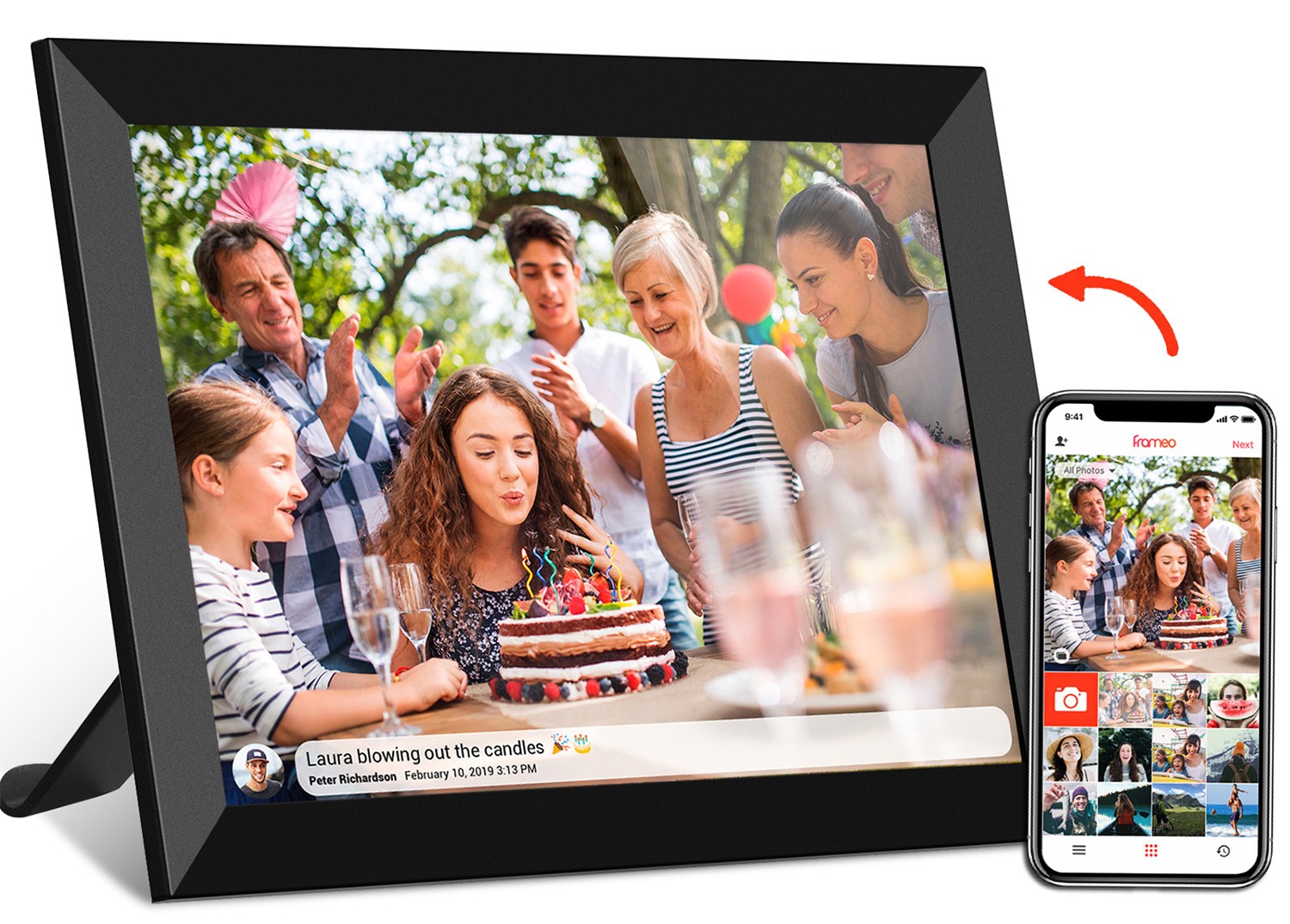
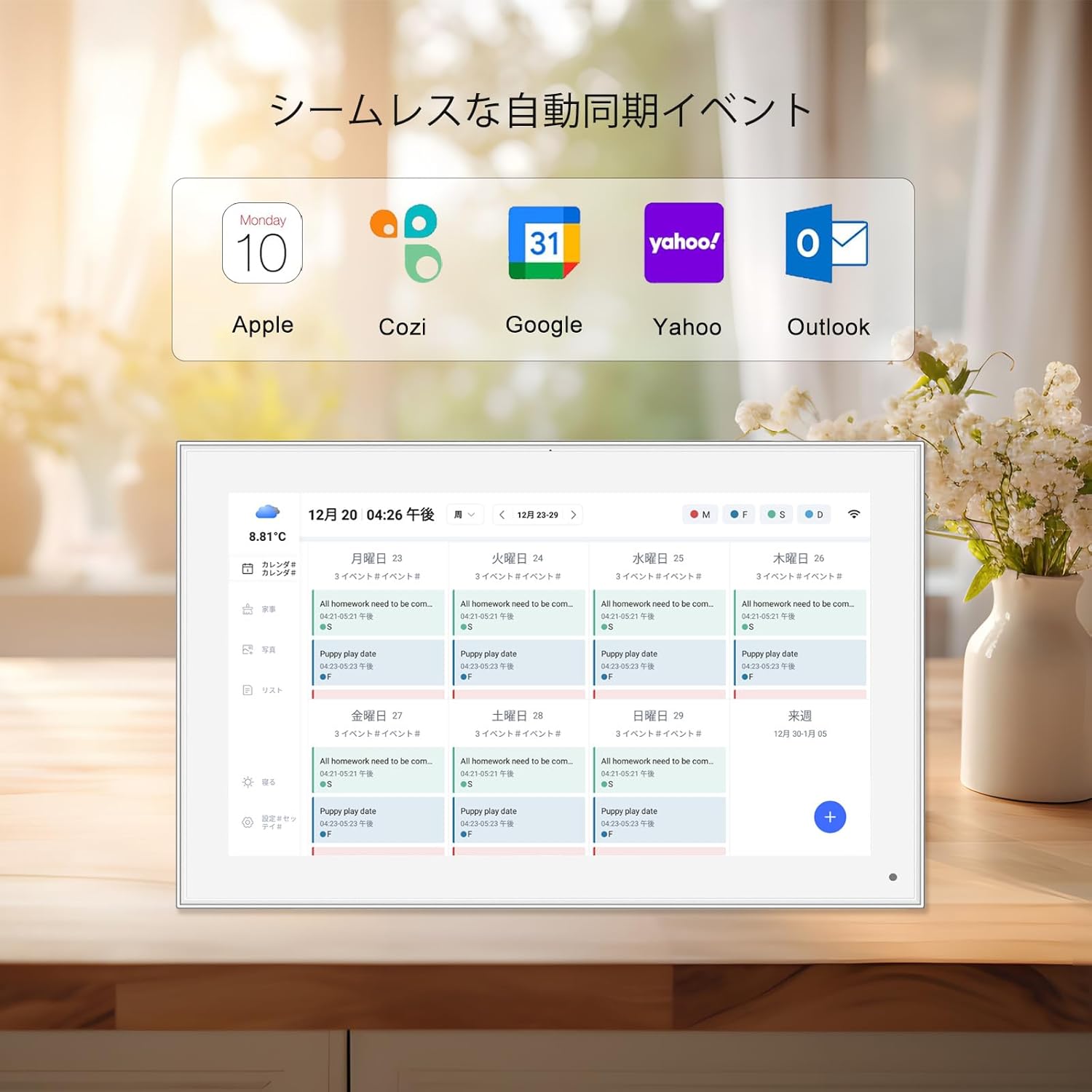
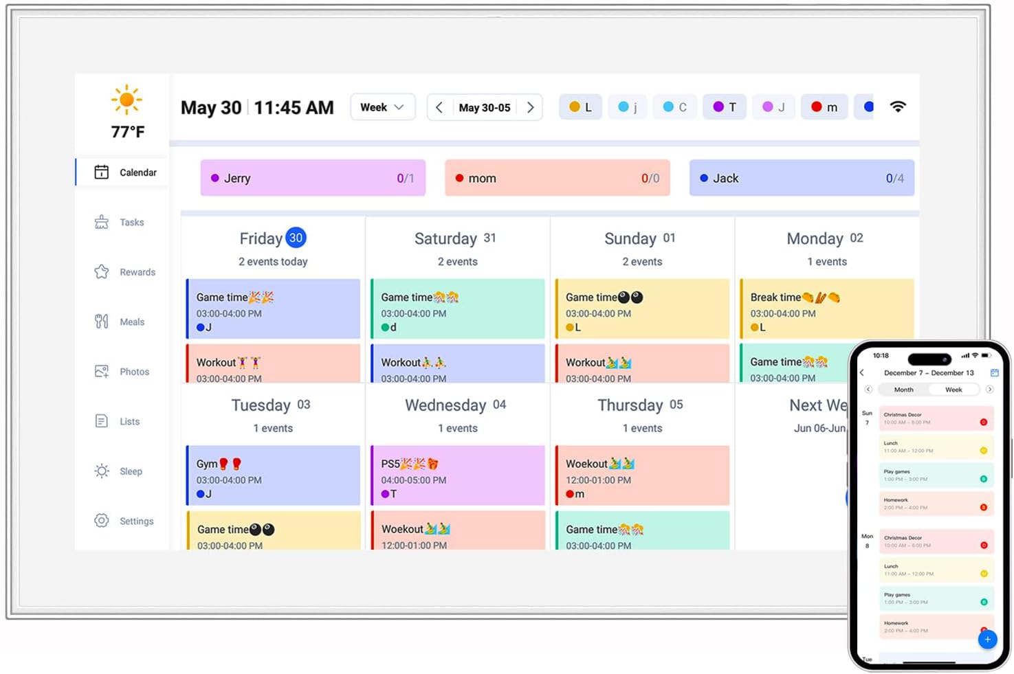
10.1 inch video brochure
with oversized controls will feel clunky and waste space. The goal is to create an interface where touches feel "invisible"—users don't think about the mechanics; they just interact. To achieve this, consider the following principles:
Touch Target Size and Spacing:
The size of interactive elements (buttons, icons, sliders) is critical. Research by usability experts shows that touch targets smaller than 44×44 pixels are prone to accidental taps, but this minimum can vary with screen size. On a
7 inch video brochure
, where the screen is compact, targets should be slightly larger relative to the display—aim for 44-50 pixels—to account for the fact that users may be holding the device with one hand, leading to less stable input. On a
10.1 inch video brochure
, targets can stay closer to the 44-pixel standard, but spacing between them should increase to prevent mis-taps (at least 8-10 pixels). For example, a "next" button on a 7 inch screen might be 50×50 pixels with 10 pixels of space around it, while the same button on a 10.1 inch screen could be 44×44 pixels with 12 pixels of spacing.
Thumb-Friendly Zones:
Most users hold portable devices with one hand, using their thumb to interact. On a
7 inch video brochure
, critical controls (like play/pause or navigation buttons) should be placed in the "thumb zone"—the area the thumb can reach without stretching, typically the bottom half of the screen. Placing important buttons in the top corners of a small screen is a common mistake; users will have to adjust their grip, leading to fatigue. On a larger
10.1 inch video brochure
, which may be held with two hands or placed on a surface, controls can be more evenly distributed, but the bottom and side edges still remain the most accessible areas for thumb or finger taps.
Feedback Mechanisms:
Users need confirmation that their touch has been registered. This can be visual (a button changing color, a subtle animation), auditory (a soft click), or haptic (a tiny vibration). On a
7 inch video brochure
, visual feedback is often sufficient—think a brief highlight around a button when tapped. On a
10.1 inch video brochure
used in noisy environments (like a busy store), haptic feedback adds an extra layer of assurance, ensuring users know their action was recognized even if they're not looking directly at the screen. For example, a training manual in a factory might use both visual and haptic feedback for critical "confirm" buttons, preventing errors in loud settings.
Gesture Support:
Swiping, pinching, and tapping are intuitive, but their use should align with screen size. On smaller screens, complex gestures (like pinch-to-zoom) can be cumbersome—users have less room to move their fingers, increasing the chance of accidental swipes. Stick to simple gestures on a
7 inch video brochure
: tap to select, swipe left/right to navigate, and long-press for menus. On a
10.1 inch video brochure
, larger surface area makes more complex gestures feasible. For example, a design software manual might let users pinch to zoom in on a diagram or swipe up to reveal toolbars—gestures that feel natural on a bigger screen.
Accessibility:
Good touch design accommodates all users, including those with motor or visual impairments. For a
10.1 inch video brochure
used in senior care, this might mean larger targets, high-contrast colors, and adjustable touch sensitivity to accommodate shaky hands. For a
7 inch video brochure
targeting children, rounded buttons and playful animations can make interaction feel like a game, encouraging engagement. Accessibility isn't just a "nice-to-have"—it expands your audience and ensures your manual works for everyone who needs it.