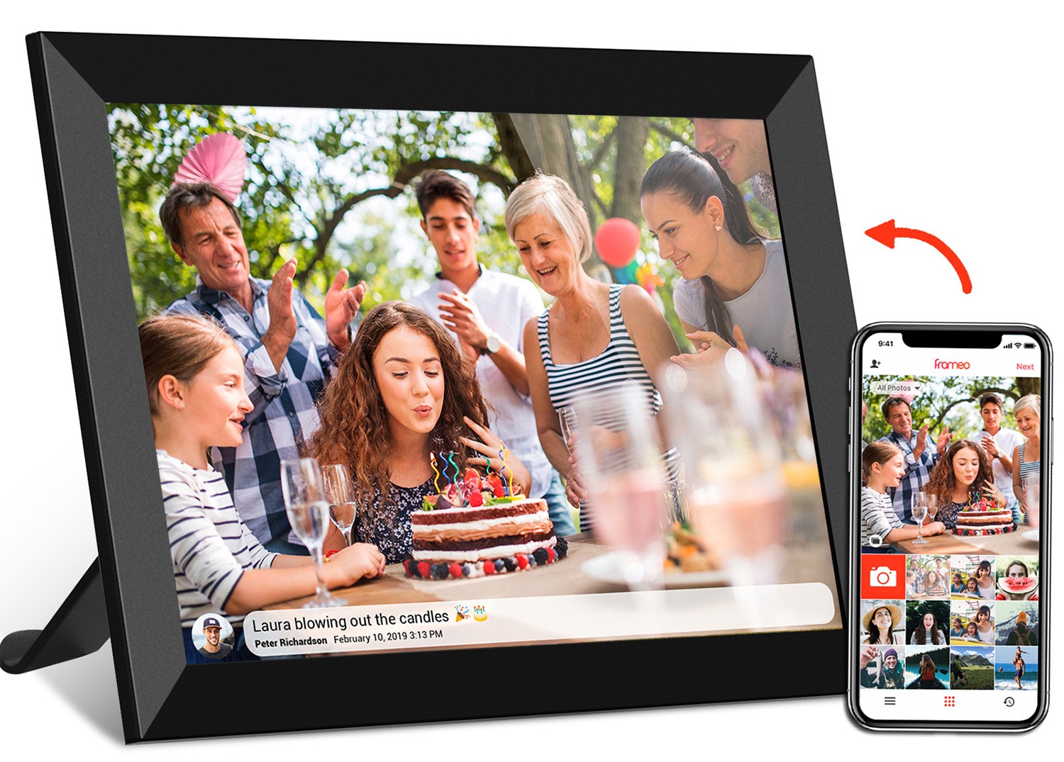
Android tablets have come a long way from being niche devices to essential tools in both consumer and professional spaces. From the 10.1 inch frameo wifi digital photo frame sitting on a grandmother's kitchen counter to the 21.5 inch digital signage displaying patient information in a hospital hallway, these devices come in all shapes and sizes. But for frontend developers, this diversity brings a unique challenge: how to ensure apps and interfaces look and work seamlessly across different screen dimensions. At the heart of this challenge lies a critical factor: aspect ratio. In this guide, we'll break down why aspect ratios matter, explore the most common ones in Android tablets today, and share practical tips for building adaptable, user-friendly interfaces—even when designing for everything from a 10.1 inch digital calendar to a 15.6 inch medical tablet pc.
Let's start with the basics. Aspect ratio is simply the proportional relationship between a screen's width and height, expressed as a ratio (width:height). It's not the same as resolution, which refers to the total number of pixels (like 1920x1080). Instead, aspect ratio tells you the shape of the screen. For example, a 10.1 inch tablet could have a 16:9 aspect ratio (widescreen) or a 4:3 aspect ratio (more square-like)—and that shape dramatically affects how content fits on the screen.
Think of it like a canvas. A 16:9 canvas is wide and short, great for watching movies. A 4:3 canvas is taller and narrower, better for displaying documents or photos without cropping. As a frontend developer, your job is to make sure the "painting" (your app's content) looks good on both—and everything in between.
You might be thinking, "Can't I just design for one size and scale everything else?" In theory, yes—but in practice, that's a recipe for frustration. Aspect ratios influence everything from how much text fits on a screen to whether a video looks stretched or a photo gets cut off. Let's break down the key reasons they matter:
Imagine building a photo viewing app for a 19 inch wifi digital photo frame 4:3 screen. Photos taken on most smartphones (which often use 4:3 or 16:9) will display beautifully without awkward cropping if the frame's aspect ratio matches. But if that same app is loaded onto a 21.5 inch digital signage screen with a 16:9 ratio, those 4:3 photos will either have black bars on the sides or get stretched horizontally—neither of which does justice to the memories they hold.
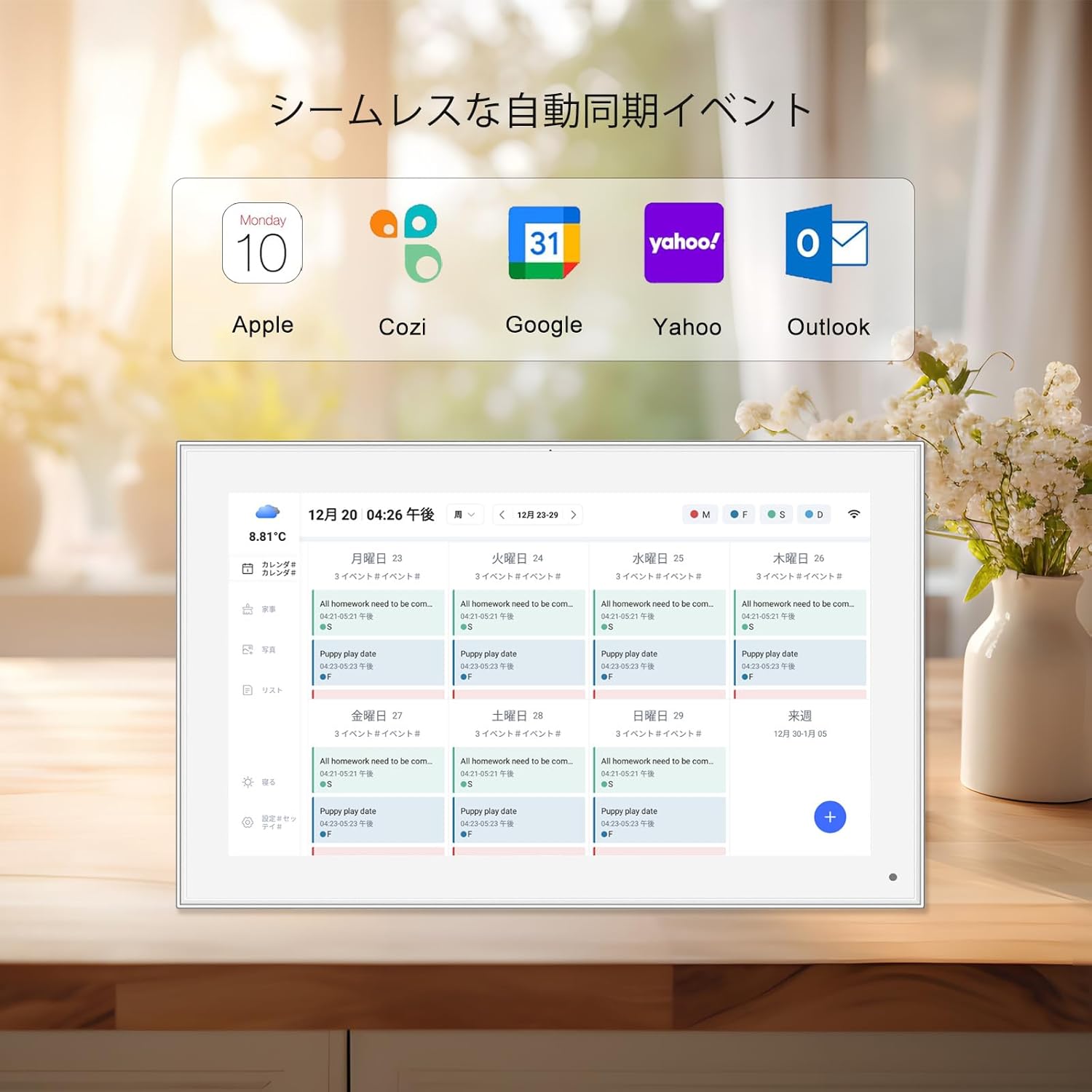
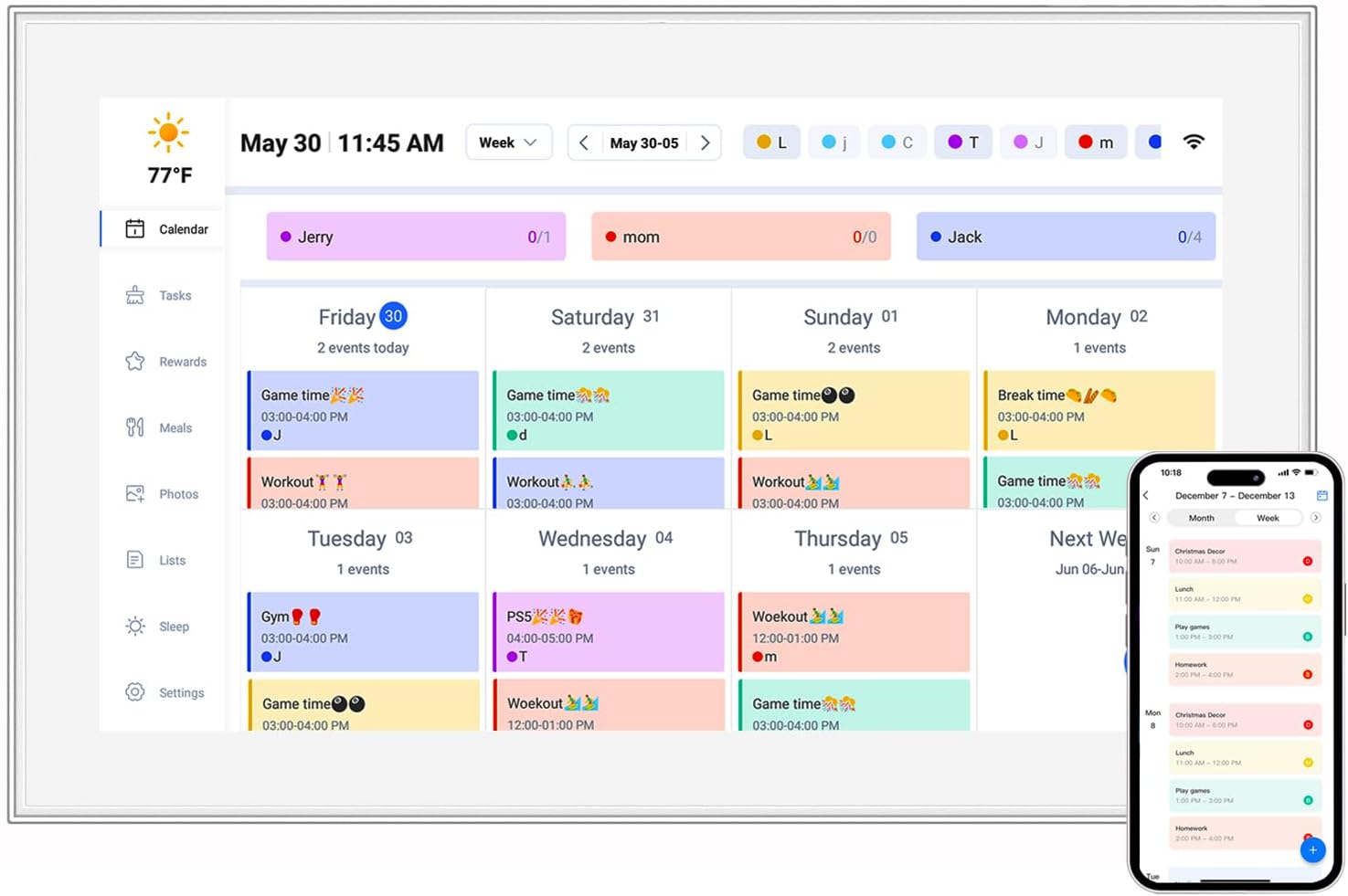
The same goes for text-heavy apps, like a 10.1 inch digital calendar. A 4:3 aspect ratio gives more vertical space, letting users see a full week at a glance, while a 16:9 screen might force them to scroll to view the same information. For users, that extra scroll isn't just an inconvenience—it's a reason to stop using the app.
Android's strength is its diversity, but that diversity means your app might run on a 10.1 inch frameo wifi digital photo frame in a home, a 15.6 inch medical tablet pc in a clinic, and a 21.5 inch digital signage display in a retail store—all in the same day. If your layout isn't aspect-ratio-aware, buttons might get squished on a wide screen, or text could overflow on a taller one. Consistency builds trust, and trust keeps users engaged.
Tablet manufacturers don't stick to one aspect ratio. Some prioritize media consumption (hello, 16:9), others focus on productivity (think 4:3 or 16:10), and niche devices like medical tablets often opt for ratios that balance screen real estate and portability. As a developer, ignoring this fragmentation means alienating users on popular devices—like the 10.1 inch frameo wifi digital photo frame, which has a dedicated user base that expects a polished experience.
Now that we've covered why aspect ratios matter, let's explore the ones you'll encounter most often. We'll break down their origins, common use cases, and how they impact frontend design—with real-world examples from the devices you're likely building for.
Chances are, you're familiar with 16:9. It's the standard for TVs, monitors, and most video content (think YouTube, Netflix, or Zoom calls). On Android tablets, it's popular for media-focused devices, where watching videos or browsing social media is the primary use case.
Device Example: 21.5 inch digital signage. These large displays are often used for advertising or information sharing, where videos and wide images are the stars. A 16:9 aspect ratio ensures content looks crisp and fills the screen, making text and visuals readable from a distance.
Pros: Perfect for video content, which is why streaming apps like Disney+ or Hulu optimize for 16:9. It's also familiar to users, so they know what to expect when interacting with media.
Cons: Less vertical space can be a downside for text-heavy apps. A 10.1 inch 16:9 tablet might show fewer lines of a document than a 10.1 inch 4:3 tablet, which can frustrate users who need to read or edit content.
If 16:9 is the movie lover's ratio, 4:3 is the multitasker's. Taller and more square, it's a throwback to the early days of computing (think old CRT monitors) but remains relevant today for devices where content, not media, is king.
Device Example: 19 inch wifi digital photo frame 4:3 screen. Photo frames are all about displaying images, and most photos (especially from older cameras or printed memories) are 4:3. This ratio ensures photos fill the screen without cropping, preserving every detail of a family vacation or graduation snapshot.
Pros: Extra vertical space makes it ideal for documents, spreadsheets, and calendars. A 10.1 inch digital calendar with a 4:3 ratio, for example, can display a full month grid without forcing users to zoom or scroll. It's also great for split-screen multitasking—you can have a notes app open on one side and a web browser on the other without either feeling cramped.
Cons: Wide videos will have black bars on the top and bottom, which some users find distracting. It's also less common in modern consumer tablets, so you'll need to test thoroughly to avoid layout issues on newer devices.
Think of 16:10 as the "Goldilocks" ratio—not too wide, not too tall. It splits the difference between 16:9 and 4:3, offering enough width for media and enough height for productivity. It's become a favorite for premium tablets and professional devices, like the 15.6 inch medical tablet pc.
Device Example: 15.6 inch medical tablet pc. Medical professionals need to view charts, patient records, and X-rays—all at once. A 16:10 ratio gives enough horizontal space to split the screen between a patient's vital signs and a medication list, while the extra vertical space ensures text-heavy records are readable without constant scrolling.
Pros: Versatility is its biggest strength. Whether you're watching a video, editing a document, or using a specialized app (like a medical EHR system), 16:10 adapts without feeling compromised. It's also becoming more common in mid-range and high-end tablets, so users are increasingly familiar with it.
Cons: It's not as "extreme" as 16:9 or 4:3, which means it might not excel at any single task. A 16:9 screen will still show videos better, and a 4:3 screen will still display more text—but 16:10 does both "good enough" for most users.
While not as mainstream as the others, 3:2 is gaining traction in productivity-focused tablets. Taller than 16:10 but not as square as 4:3, it's designed for users who spend hours typing, reading, or editing. You'll find it in devices like Microsoft's Surface line, and some Android manufacturers are starting to adopt it for premium models.
| Aspect Ratio | Common Use Cases | Device Examples | Pros | Cons |
|---|---|---|---|---|
| 16:9 | Media consumption (videos, streaming), digital signage | 21.5 inch digital signage, portable monitors | Optimized for video, familiar to users | Limited vertical space for text; photos may crop |
| 4:3 | Photo frames, calendars, productivity apps | 19 inch wifi digital photo frame 4:3 screen, 10.1 inch digital calendar | Extra vertical space for text/docs; ideal for photos | Videos show black bars; less common in modern media devices |
| 16:10 | Medical tablets, multitasking, premium consumer devices | 15.6 inch medical tablet pc, 10.1 inch frameo wifi digital photo frame | Balances media and productivity; versatile | Not specialized for any single task |
| 3:2 | Productivity, typing, reading | Premium Android tablets (emerging) | Excellent for text and multitasking | Less common; may require extra testing |
Even with a solid understanding of aspect ratios, frontend development has its hurdles. Let's walk through the most common challenges and how to navigate them.
Fixed-size elements are the enemy of aspect ratio adaptability. If you set a button's width to 300px, it might look fine on a 10.1 inch screen but get lost on a 21.5 inch digital signage display. On the flip side, a 200px tall header could overflow on a 4:3 tablet with limited vertical space. The solution? Use relative units like percentages or viewport width/height (vw/vh) instead of fixed pixels.
Photos and videos are often the hardest content to adapt. A 16:9 video on a 4:3 screen will either have black bars (letterboxing) or get cropped (pillarboxing). Neither is ideal, but you can guide the experience. For example, in a 10.1 inch frameo wifi digital photo frame app, prioritize preserving the photo's original aspect ratio with subtle letterboxing, rather than stretching it. For videos, let users toggle between full-screen (cropped) and original (letterboxed) modes.
Android's accessibility guidelines recommend touch targets be at least 48x48dp (density-independent pixels). On a wide 16:9 screen, buttons might get spread out, making them hard to tap, while on a 4:3 screen, they could bunch up. Using flexible layouts with minimum and maximum sizes (via CSS's min-width/max-width or Android's ConstraintLayout) ensures buttons stay within that 48dp sweet spot, no matter the ratio.
Emulators are great, but they can't replicate the real-world feel of a 19 inch wifi digital photo frame 4:3 screen or a 15.6 inch medical tablet pc. Whenever possible, test on physical devices—or use Android Studio's Device Manager to simulate multiple aspect ratios. Pay attention to edge cases, like landscape vs. portrait orientation (yes, some tablets are used in both!) and how your layout adjusts.
Now that we've covered the challenges, let's talk solutions. These best practices will help you build interfaces that adapt gracefully to any aspect ratio, from a 10.1 inch digital calendar to a 21.5 inch digital signage display.
Forget fixed grids—use responsive layouts that adapt to available space. For web apps, CSS Grid and Flexbox are your friends. Grid lets you define rows and columns that resize based on the screen, while Flexbox handles dynamic content alignment. For native Android apps, ConstraintLayout is a must: it lets you pin elements to edges, set ratios, and create flexible chains that expand or contract with the screen.
Pixels (px) are hardware-dependent, but dp (or dip) scale with the device's screen density. A button set to 48dp will look the same size on a 10.1 inch frameo wifi digital photo frame and a 15.6 inch medical tablet pc, even if their resolutions differ. Android converts dp to actual pixels based on the device's density, so your layout stays consistent across hardware.
Not all content is equal. On a wide 16:9 screen, you might show a sidebar with extra info, but on a tall 4:3 screen, that sidebar could collapse into a dropdown menu. Use conditional layouts to prioritize key content (like a calendar's date grid) and tuck secondary content (like settings) behind menus or tabs when space is tight. Tools like Android's Jetpack Compose or CSS media queries make this easy.
As mentioned earlier, emulators can only take you so far. If you're designing for a specific device, like the 19 inch wifi digital photo frame 4:3 screen, reach out to the manufacturer for specs (or better yet, borrow a unit). For general apps, test on at least three aspect ratios: 16:9, 4:3, and 16:10. This covers most of the market and helps you catch layout issues early.
For images and videos, use aspect ratio boxes to reserve space before content loads, preventing layout shifts. In CSS, this can be done with padding-top (e.g., padding-top: 56.25% for 16:9). In Android, use the androidx.constraintlayout.widget.AspectRatio widget to lock a view's ratio, ensuring media doesn't stretch or squish.
Pro Tip: For the 10.1 inch frameo wifi digital photo frame, consider adding a "smart crop" feature that analyzes photos and suggests the best aspect ratio for display. Users love feeling like the app is working with their content, not against it.
Aspect ratios might seem like a technical detail, but they're the foundation of great user experiences on Android tablets. From the 10.1 inch digital calendar that helps someone stay organized to the 15.6 inch medical tablet pc that keeps patients healthy, the way your app adapts to different screen shapes can make or break its success.
By understanding mainstream ratios (16:9 for media, 4:3 for photos, 16:10 for balance), addressing common challenges (content scaling, touch targets, testing), and following best practices (flexible layouts, relative units, prioritizing content), you'll build apps that feel tailor-made for every device—without the extra work. After all, the best frontend development isn't about designing for one screen; it's about designing for all screens.
So the next time you sit down to code, remember: aspect ratios aren't obstacles—they're opportunities to create experiences that delight users, no matter if they're using a 10.1 inch frameo wifi digital photo frame in their living room or a 21.5 inch digital signage display in a busy airport. Happy coding!