Walk into any modern café, hospital waiting room, or corporate office, and you'll likely spot digital signage glowing from the walls, desks, or even the floor. These screens—whether they're a sleek floor standing digital signage unit in a mall or a compact desktop tablet L-type series on a reception desk—are powerful tools for sharing information, engaging customers, and streamlining communication. But here's the catch: even the most creative content can fall flat if it's not designed to fit the device it's displayed on. A beautiful video that looks stunning on a 55-inch screen might become a jumbled mess on a 10.1-inch tablet, and a text-heavy presentation that works in a meeting room could be unreadable on a small digital photo frame.
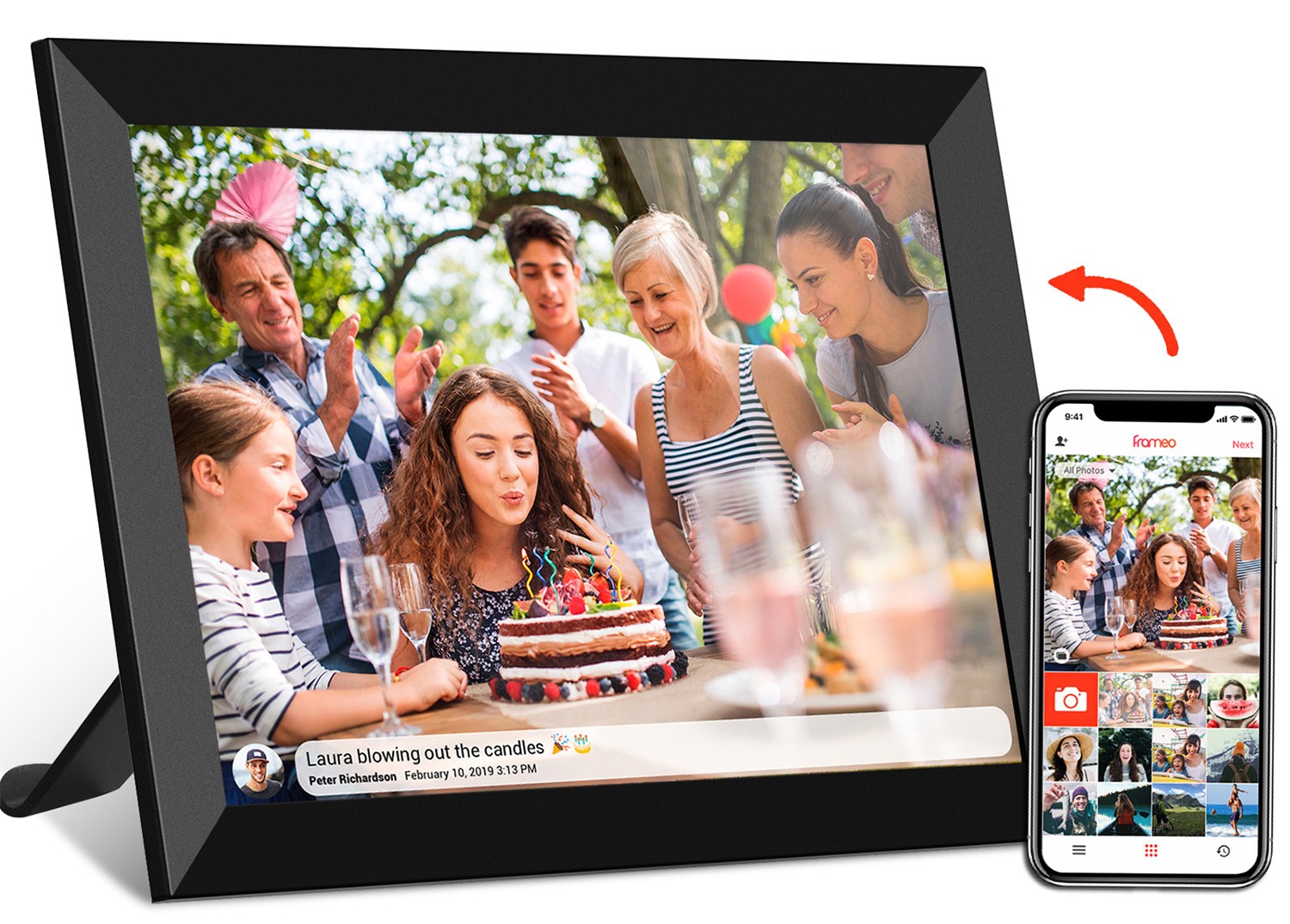
As someone who's worked with businesses to optimize their digital displays, I've seen firsthand how (overlooking) device size can turn a promising signage strategy into a frustrating waste of resources. A local bakery once invested in a 21.5 inch wifi digital photo frame to showcase daily specials, only to realize their carefully designed menu graphics were so small that customers squinted to read the prices. A clinic tried using a generic healthcare app on a POE meeting room digital signage screen, but the tiny font made patient instructions nearly impossible to follow. The solution? Coordinating content design with device size isn't just a "nice-to-have"—it's the backbone of effective digital communication.
Before diving into design tips, it's critical to understand the different types of digital signage devices and how their size impacts their purpose. Digital signage suppliers offer a dizzying array of options, from pocket-sized video brochures to towering 55-inch wall boards. Each size is engineered for a specific environment and audience interaction—so your content needs to align with that.
| Device Type | Typical Size Range | Primary Use Case | Key Audience Interaction |
|---|---|---|---|
| Floor Standing Digital Signage | 21.5 – 55 inches | Public spaces (malls, lobbies, retail stores) | Viewed from 5+ feet away; quick, visual engagement |
| POE Meeting Room Digital Signage | 10.1 – 24 inches | Corporate meetings, conference rooms | Viewed from 2–5 feet; detailed text, presentations |
| Desktop Tablet L-Type Series | 10.1 – 15.6 inches | Desks, reception areas, small offices | Viewed from 1–3 feet; personal or small-group use |
| 21.5 Inch Wifi Digital Photo Frame | 21.5 inches (16:9 aspect ratio) | Retail, cafés, waiting rooms (showcasing visuals/menus) | Mixed distance (3–8 feet); balance of images and text |
Let's break this down. A floor standing digital signage unit, like those you see in airport terminals, is built to grab attention from afar. Its large size (often 43 inches or more) means it can display bold visuals, animations, or short videos that people notice even while walking by. On the flip side, a desktop tablet L-type series—think of the tablets you might see at a hotel front desk—sits close to the viewer, so it needs to prioritize readability and quick access to information (like check-in forms or local recommendations). The 21.5 inch wifi digital photo frame, a popular middle-ground option, is versatile: it works in both retail (displaying product images) and healthcare (showing patient education videos), but its content must strike a balance between visual appeal and clarity.
Size alone isn't enough—you also need to consider aspect ratio, the proportional relationship between a screen's width and height. Most digital signage uses a 16:9 ratio (widescreen), which is great for videos and landscape photos. But some devices, like older digital photo frames or certain meeting room tablets, use 4:3 (more square), which is better for text-heavy content or portrait-oriented visuals. Using the wrong aspect ratio can stretch or crop your content, turning a professional design into something that looks amateurish.
For example, I once helped a restaurant chain that had designed all their menu graphics for 16:9 screens but installed them on 4:3 desktop tablet L-type series devices at each table. The result? Burgers looked squashed, and text was cut off at the edges. It took weeks of reformatting to fix, and in the meantime, customers complained about the "messy" menus. Don't make that mistake—always check your device's aspect ratio before finalizing content.
Now, let's get practical. How do you design content that shines on any device size? Below are actionable tips tailored to the most common digital signage categories.
These large screens are all about impact. They're meant to draw the eye from across a room, so your content should be bold, simple, and visually striking. Here's how to approach it:
Meeting room screens are workhorses—they display agendas, presentations, and real-time data. Since viewers are closer (2–5 feet away), readability and detail are key:
Desktop tablets are personal or small-group tools—think reception check-ins, hotel room controls, or office desk reminders. Their smaller size means content must be concise and user-friendly:
The 21.5 inch wifi digital photo frame is a fan favorite for its flexibility—it works in homes, offices, and retail. Its size (not too big, not too small) means it needs a hybrid approach:
Let's wrap up with a real-world example. A local bookstore recently invested in two types of digital signage: a 43-inch floor standing unit near the entrance to promote new releases, and a 10.1-inch desktop tablet L-type series at the checkout counter to upsell accessories (bookmarks, journals). Initially, they used the same graphics for both, and results were dismal—entrance traffic barely noticed the promotions, and checkout upsells dropped by 15%.
After analyzing the issue, we realized the entrance screen's text was too small (24px), and the checkout tablet's images were stretched (16:9 graphics on a 4:3 screen). We redesigned the entrance content with 60px headlines and full-screen author photos, and adjusted the checkout tablet to 4:3 with large "Add to Cart" buttons. Within two weeks, new release sales spiked by 30%, and checkout upsells returned to pre-launch levels.
Coordinating content and device size doesn't have to be complicated. Here are a few tools and habits to make the process smoother:
Digital signage is a powerful tool, but its success hinges on one simple truth: content and device size must work in harmony. Whether you're using a towering floor standing unit, a compact desktop tablet, or a versatile 21.5 inch wifi digital photo frame, the key is to design with the viewer in mind—how far they'll stand, what they need to see, and how quickly they'll engage. By following these tips, you'll transform your digital screens from passive displays into active storytellers that inform, persuade, and connect.
So, the next time you're creating content for your digital signage, take a step back and ask: "Does this fit the device?" Your audience (and your bottom line) will thank you.