Walk into any home, office, or café, and you'll likely be surrounded by screens. From the moment we wake up to the second we fall asleep, devices shape how we connect, work, learn, and unwind. But have you ever stopped to think about why some devices feel effortless to use, while others leave you squinting, fumbling, or simply frustrated? The answer often lies in a delicate dance between two critical elements: size and interface . Get this balance right, and a device becomes an extension of yourself—intuitive, unobtrusive, and even joyful. Get it wrong, and even the fanciest tech feels like a chore.
In this article, we'll explore how size and interface intersect across four everyday device categories: digital photo frames, portable monitors, kids tablets, and digital signage. We'll dive into real-world examples, user stories, and design principles that show how the best devices don't just have a size and interface—they balance them. Along the way, we'll touch on how brands like Frameo are redefining what's possible, and why a 10.1 inch screen might be perfect for your nightstand but terrible for a mall display. Let's start by asking: What even is this balance, and why does it matter?
At first glance, size and interface might seem like separate considerations. Size is about physical dimensions—how big the screen is, how much space it takes up, how easy it is to carry. Interface is about the digital layer—the buttons, menus, touch targets, and software that let you interact with the device. But here's the truth: they're two sides of the same coin. A tiny screen crammed with tiny buttons isn't just "small"—it's hard to use . A massive screen with a clunky, confusing menu isn't just "big"—it's overwhelming . The magic happens when size and interface adapt to each other and to you .
Consider this: A 21.5 inch digital photo frame might sound impressive, but if it's meant to sit on a narrow bookshelf, its size becomes a liability. Conversely, a 7 inch kids tablet designed for little hands needs an interface with big, colorful icons—otherwise, tiny fingers will miss targets and cause frustration. The goal isn't to pick "big" or "small," "simple" or "feature-packed." It's to ask: Who is using this device, and where? The answer to that question determines everything.
Digital photo frames are a beautiful example of how size and interface work in harmony. Unlike a laptop or phone, their primary job is to display memories—not to be a workhorse. But that simplicity hides a design challenge: How do you make sure the frame itself doesn't distract from the photos, while still letting users easily update and enjoy their content?
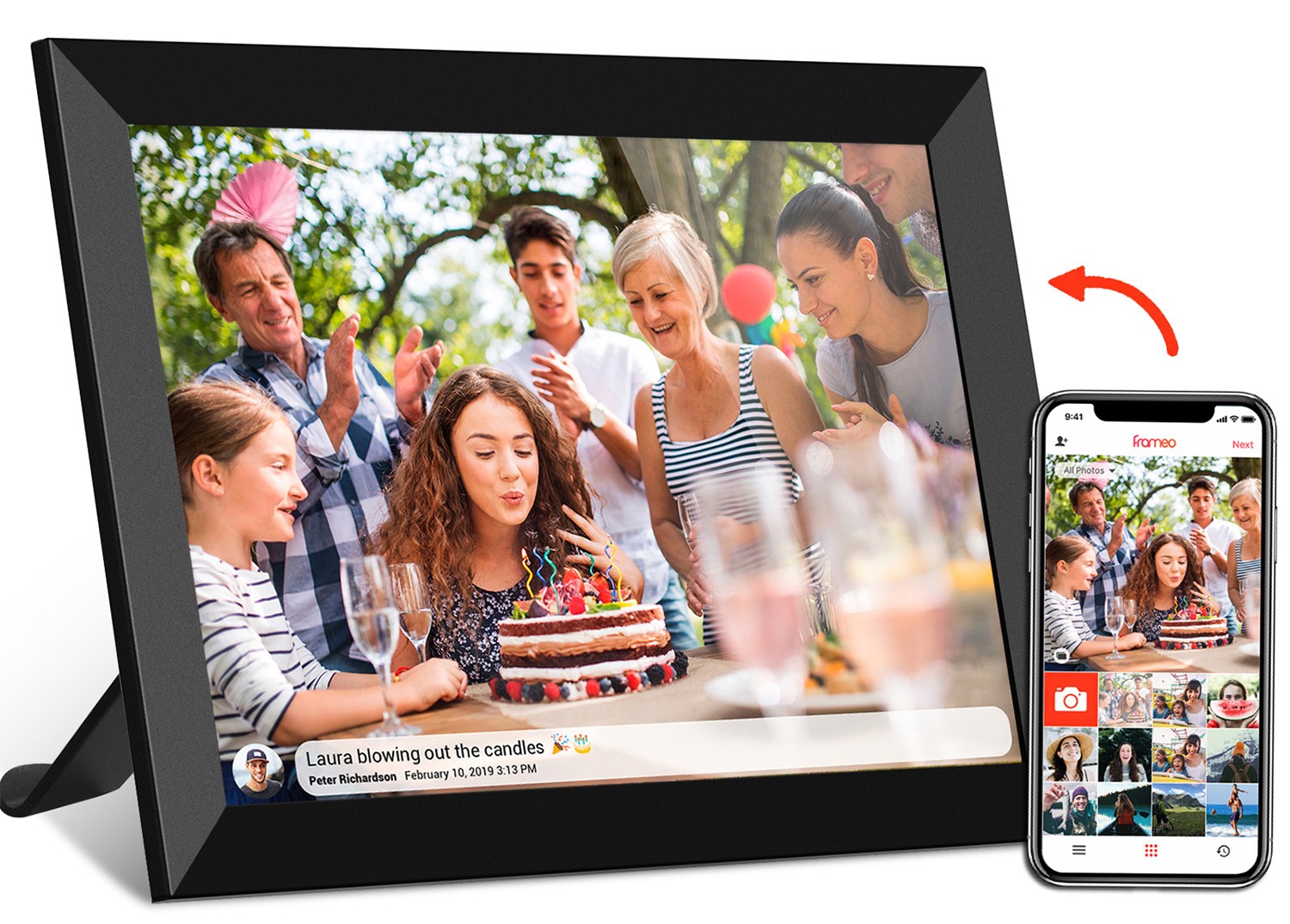
Let's start with size. A digital photo frame's dimensions dictate where it lives. A 10.1 inch frameo wifi digital photo frame, for example, is perfect for a nightstand or desk. It's small enough to not dominate the space but large enough to show off a family photo or vacation snapshot without squinting. I recently set one up for my grandmother, and within a week, she was gushing about how she "wakes up to the grandkids every morning." The size felt intimate, like a physical photo album, but with the convenience of digital updates.
Jump up to a 21.5 inch wifi digital photo frame, and the vibe shifts entirely. This size belongs in a living room, kitchen, or office lobby—spaces where multiple people gather. Imagine a family reunion: everyone crowding around a 21.5 inch screen to ooh and aah at photos from the day before. The larger size turns the frame into a focal point, a conversation starter. But here's the catch: a bigger screen demands a better interface. If my grandmother's 10.1 inch frame can get by with a simple remote or app, a 21.5 inch model needs more—maybe a touchscreen for swiping, or a more robust app for organizing albums. Otherwise, that big, beautiful display becomes a glorified paperweight.
Which brings us to interface. The best digital photo frames—like those using Frameo's cloud frame technology—understand that the interface should fade into the background. Frameo's app, for example, lets you send photos to the frame from anywhere in the world with a few taps. For the user, that means grandma doesn't have to learn how to "sync" or "upload"—she just receives photos automatically. On the frame itself, the interface is minimal: a small status bar at the bottom, maybe a power button on the back. No menus, no confusing settings—just photos, sliding gently from one memory to the next.
But interface adjustments are needed as size grows. A 21.5 inch frameo wifi digital picture frame with touch might include a "swipe to delete" feature for unwanted photos, or a "zoom" function for getting up close to details. The touch targets (the buttons or areas you tap) need to be bigger, too—after all, if you're standing across the room, you don't want to lean in to hit a tiny icon. Conversely, a 10.1 inch frame might skip touch entirely, relying instead on a remote or voice commands (if it's smart home-enabled). Why? Because on a small frame, a remote is easier to lose, but a touchscreen might get smudged by frequent handling—so the interface adapts to the size's limitations.
The takeaway? For digital photo frames, size sets the stage (where it lives, how many people use it), and interface sets the mood (how easy it is to enjoy). A 10.1 inch frameo model nails this for personal spaces; a 21.5 inch touchscreen frame shines in shared ones. The balance? Never let the frame's size or interface overshadow the photos themselves.
Portable monitors are the unsung heroes of modern work and play. They turn a laptop into a dual-screen setup, let gamers enjoy bigger visuals on the go, and even serve as extra displays for digital artists. But here's the paradox: The whole point of a portable monitor is to be… well, portable. So how do you balance a screen big enough to be useful with a size small enough to carry? And how does the interface (the buttons, settings, and physical design) keep up?
Let's compare two popular sizes: 15.6 inch and 24.5 inch portable monitors. A 15.6 inch model is the sweet spot for most people. It's lightweight (often under 2 pounds), fits in a backpack, and offers enough screen real estate to edit documents, stream shows, or extend a laptop display. I tested a 15.6 inch portable monitor last year while traveling for work, and it was a game-changer. I could spread out my email, calendar, and project notes without squishing everything onto my laptop's 13 inch screen. Its size felt like a "bonus" screen—not a burden.
Now, a 24.5 inch portable monitor. On paper, it sounds amazing: a near-desktop-sized screen you can take anywhere! But in reality, "portable" becomes a stretch. These monitors often weigh 4 pounds or more, require a sturdy stand, and are too big for a standard backpack. They're better suited for "semi-portable" use—like moving from your home office to the living room, not from New York to London. That said, for gamers or video editors who need every inch of screen space, the 24.5 inch size is worth the tradeoff. But again, size demands interface adjustments.
A portable monitor's interface isn't just about on-screen menus—it includes physical design, too. Take the stand, for example. A 15.6 inch monitor can get away with a flimsy, foldable stand because it's light. A 24.5 inch monitor needs a sturdier, adjustable stand to prevent wobbling—otherwise, typing on your laptop next to it might shake the screen. That's interface design in action: the stand adapts to the size.
Then there are the buttons and ports. A 15.6 inch monitor might have tiny, hard-to-reach buttons on the bottom bezel—acceptable, since you won't adjust settings often. A 24.5 inch monitor, though, needs larger, more accessible buttons (or even a remote) because users are more likely to tweak brightness, contrast, or input sources. Imagine setting up a 24.5 inch monitor for a presentation and fumbling with tiny buttons in front of a crowd—that's a balance fail.
Even the screen itself is part of the interface. A 15.6 inch monitor with a 16:9 aspect ratio is great for movies and spreadsheets. A 24.5 inch model might offer a 16:10 ratio for more vertical space—better for coding or reading long documents. The interface (in this case, the aspect ratio) adapts to how the larger size will be used. It's not just about "bigger"—it's about "bigger and better suited ."
If there's one group that exposes bad design faster than anyone, it's kids. A kid's tablet that's too big will get dropped. One that's too small will be frustrating to use. An interface that's too complex will lead to tears (and maybe a thrown device). Kids tablets are a masterclass in balancing size for little hands and interface for little brains.
Let's start with size. A 7 inch kids tablet is perfect for toddlers and preschoolers. Small enough to grip with one hand, light enough to carry around, and durable enough to survive a fall onto the floor (or the occasional chew). My nephew, age 3, has a 7 inch tablet, and watching him use it is a lesson in design: he holds it like a book, taps the big, round icons with his pointer finger, and never complains about "being tired" of holding it. The size fits his physical capabilities—no adult-sized hands required.
Older kids (ages 6–10) often prefer a 10.1 inch kids tablet. They're bigger, so they can play games, watch cartoons, and even do schoolwork without squishing content. My 8-year-old cousin uses a 10.1 inch model for her math apps and art projects, and she loves that she can "see more stuff" on the screen. But here's the thing: a 10.1 inch tablet for kids isn't just a scaled-up 7 inch model. It needs a more robust build (since older kids are more likely to toss it into a backpack) and a slightly more complex interface (since they can handle more features)—but not too complex. It's a tightrope walk between "growing with the child" and "not overwhelming them."
The interface of a kids tablet is all about simplicity and control . For little kids, this means big, colorful icons with clear pictures (a duck for a drawing app, a puzzle piece for a game). No text-heavy menus, no tiny buttons, no confusing settings. The interface should guide them without making them think—like a digital playground.
For parents, though, the interface needs a hidden layer: parental controls. A good kids tablet lets parents set time limits, block inappropriate content, and track usage—all through a separate, password-protected menu. On a 7 inch tablet, this menu might be tucked away in a "grown-ups only" corner with a simple PIN. On a 10.1 inch model, it might be a more detailed dashboard with graphs and app-specific controls. Either way, the interface balances the child's need for simplicity with the parent's need for control.
Durability is also part of the interface. A rubberized case, reinforced corners, and water resistance—these are physical interface elements that adapt to the size. A 7 inch tablet's case can be thicker and chunkier (since the tablet is small), while a 10.1 inch case needs to be slimmer to keep the tablet portable. It's all about protecting the device without making it harder for the kid to use.
Digital signage is everywhere: in malls, airports, hospitals, and even grocery stores. Its job is to inform, advertise, or entertain—often from a distance. But here's the challenge: a sign that's too small won't be seen. One that's too big might be ignored (or even block foot traffic). And the interface—how content is managed and displayed—needs to work for both the people creating the content and the people viewing it.
Let's compare two extremes: a 21.5 inch wall-mounted digital signage and a 43 inch floor standing digital signage. The 21.5 inch model is ideal for intimate spaces: a doctor's office waiting room, a small café, or a hotel lobby. It's big enough to be noticed (you can read the menu or check-in instructions from a few feet away) but not so big that it dominates the room. I recently visited a dental clinic with 21.5 inch digital signage showing patient education videos, and it worked perfectly—people watched while waiting, but it didn't feel intrusive.
A 43 inch floor standing digital signage, on the other hand, is built for crowds. Think of a busy mall, a convention center, or a stadium. Its size demands attention: you can see promotions or directions from 20 feet away. But size alone isn't enough. A 43 inch screen with tiny text or blurry images is worse than no screen at all. That's where interface comes in—specifically, the content management interface.
Digital signage's interface has two users: the viewer and the manager . For viewers, the interface is the content itself. Text must be large enough to read from a distance, colors bright enough to stand out, and videos short enough to hold attention. A 43 inch sign might use bold, 72-point font for headlines, while a 21.5 inch sign can get away with 48-point font. The interface (the content layout) adapts to the size to ensure visibility.
For managers, the interface is the software that lets them update content. A 21.5 inch wall-mounted sign in a café might have a simple, touch-based interface—staff can tap the screen to switch between breakfast and lunch menus. A 43 inch mall sign, though, needs a remote management system (accessed via a laptop or phone) because it's too big to stand next to and too busy to disrupt with on-site updates. The interface adapts to the size's accessibility: small signs are easy to reach, so touch works; big signs are not, so remote control is better.
Even the aspect ratio matters. A 16:9 screen is great for videos, while a 4:3 screen might be better for photos or text-heavy content. A 21.5 inch digital signage with a 4:3 screen could display a menu with clear, readable text, while a 43 inch 16:9 screen is perfect for a promotional video. The interface (in this case, the aspect ratio) aligns with the size and the content type.
After exploring these four categories, a pattern emerges. Balancing size and interface isn't about following a one-size-fits-all rule—it's about asking three key questions:
To illustrate this, let's look at a comparison table of the devices we've discussed, highlighting how size and interface adapt to these questions:
| Device Type | Common Sizes | Key Interface Features | User & Use Case |
|---|---|---|---|
| Digital Photo Frame | 10.1 inch, 21.5 inch | Frameo cloud sharing, touch/non-touch controls, slideshow settings | Individuals (nightstand) vs. families (living room); displaying photos |
| Portable Monitor | 15.6 inch, 24.5 inch | Adjustable stands, accessible buttons, aspect ratio options | Travelers (backpack) vs. gamers/editors (semi-portable); extending screen space |
| Kids Tablet | 7 inch, 10.1 inch | Big icons, parental controls, durable case | Toddlers (small hands) vs. older kids (schoolwork); education/entertainment |
| Digital Signage | 21.5 inch (wall), 43 inch (floor) | Large text, remote content management, touch/non-touch | Small spaces (café) vs. crowds (mall); advertising/informing |
The table shows that there's no "best" size or interface—only the best combination for the situation. A 10.1 inch frameo wifi digital photo frame with simple cloud sharing is perfect for a grandma in Iowa. A 43 inch floor standing digital signage with bold text and remote updates is perfect for a busy mall in Chicago. The balance is in the details.
At the end of the day, devices are tools, but they're also companions. They sit on our desks, in our bags, and on our walls, shaping how we connect with the world. The best ones feel like they were designed for us —not just for specs or trends. That's the magic of balancing size and interface: when done right, you don't notice the device at all. You notice the photos, the work, the fun, or the information it delivers.
So the next time you're shopping for a digital photo frame, portable monitor, kids tablet, or digital sign, don't just look at the size or the features. Ask: Does this fit me, my space, and what I need it to do? If the answer is yes, you've found the balance. And that's when tech stops being "tech"—and starts being a part of your life.