In today's fast-paced digital world, Android tablets have become more than just gadgets—they're companions that keep us connected, entertained, and productive. From streaming movies to managing schedules, sharing family photos, or even keeping kids engaged with educational content, these devices play a central role in our daily lives. But here's the thing: not all tablets are created equal, especially when it comes to screen size and resolution. Among the many specs that matter, 1080p resolution (1920x1080 pixels) has emerged as a sweet spot for balancing clarity and affordability. Yet, pairing 1080p with the right screen size is where the magic happens—or where things can go wrong. That's where "size optimization" comes in. It's not just about picking a random inch measurement; it's about finding the perfect harmony between resolution, physical dimensions, and how we actually use the device. In this article, we'll dive deep into why 1080p size optimization matters for Android tablets, explore the key factors that influence it, and look at real-world examples—like the 10.1 inch android kids tablet pc, 10.1 inch digital calendar, and 10.1 inch wireless wifi digital photo frame—to see how getting the size right elevates the user experience.
Before we jump into size optimization, let's make sure we're all on the same page about 1080p. Technically, 1080p refers to a resolution of 1920 pixels horizontally and 1080 pixels vertically, often called "Full HD." On a screen, this translates to millions of tiny dots (pixels) working together to display images, text, and videos. The more pixels you have, the sharper and more detailed the content—think crisp photos, clear text, and smooth video playback without blurriness or pixelation.
But here's the catch: resolution alone doesn't tell the whole story. A 1080p display on a 5-inch phone will look drastically different from a 1080p display on a 24-inch monitor. Why? Because pixel density—measured in pixels per inch (PPI)—changes with screen size. PPI is calculated by dividing the diagonal pixel count by the physical screen size. For example, a 10.1 inch tablet with 1080p resolution has a PPI of around 224, while a 15.6 inch tablet with the same resolution drops to about 141 PPI. The higher the PPI, the sharper the image, because pixels are packed more tightly together, making individual pixels invisible to the naked eye.
For Android tablets, 1080p strikes a balance between visual quality and practicality. It's sharp enough for most tasks—browsing, gaming, watching videos, or reading—without requiring the processing power or battery drain of higher resolutions like 2K or 4K. This makes 1080p tablets more affordable and longer-lasting, two key factors for everyday users. But to truly shine, 1080p needs the right screen size. Too small, and you're not taking full advantage of the resolution; too large, and the image starts to look soft. So, what's the "right" size? Let's explore that next.
Imagine buying a 1080p tablet thinking it'll be perfect for streaming, only to find the screen is so small you have to squint to read subtitles, or so large it's impossible to carry around. That's the result of poor size optimization. The goal is to find a size that maximizes the benefits of 1080p while fitting how you actually use the device. Let's break down why this matters:
Tablets are meant to be mobile, but they also need enough screen space to replace laptops or e-readers for certain tasks. A 7-inch 1080p tablet might be super portable, but typing an email or editing a photo would feel cramped. On the flip side, a 15.6 inch 1080p tablet has plenty of space, but try tucking that into a backpack or using it on the go—it's more like a mini laptop than a tablet. The sweet spot? Most users find 10 to 12 inches ideal. At this size, the tablet is light enough to hold with one hand for short periods, fits comfortably in a bag, and has enough screen space for multitasking (like splitting the screen between a browser and a note app) without feeling cluttered.
1080p is all about detail, but that detail only matters if you can see it. A 1080p video on a 10.1 inch screen looks vibrant and sharp because each pixel contributes to the image. On a larger screen with the same resolution, those pixels are spread out, so details like facial expressions in a movie or text in an e-book start to lose clarity. For example, a 21.5 inch 1080p tablet (while great for digital signage, where viewers are farther away) would look noticeably softer up close compared to a 10.1 inch model. Size optimization ensures that 1080p content—whether it's a YouTube video, a PDF, or a family photo—looks its best at typical viewing distances.
Tablets are often used for hours at a time—whether binge-watching a show, working on a project, or keeping kids entertained on a road trip. A poorly sized tablet can lead to hand fatigue, neck strain, or even eye discomfort. A 10.1 inch tablet, for instance, is lightweight enough to hold for extended periods (most weigh around 400-500 grams), and the screen is large enough that you don't have to hunch over to see it. Compare that to a 13.3 inch tablet, which might weigh 600+ grams—after 30 minutes of holding it, your arm will start to ache. Size optimization isn't just about pixels; it's about making the device comfortable to use, so you can enjoy it without physical strain.
Different users need different sizes. A student might prioritize portability for taking notes in class, while a parent might want a larger screen for their child's educational games. A business professional might need a tablet that's easy to mount in a meeting room, while a grandparent might prefer a size that's simple to place on a kitchen counter for viewing family photos. Size optimization ensures that the tablet's dimensions align with its intended use. For example, the 10.1 inch android kids tablet pc is designed to be large enough for kids to interact with games and videos but small enough for little hands to hold. Similarly, the 10.1 inch digital calendar is compact enough for a desk but large enough to display dates, appointments, and even weather updates at a glance.
Size optimization isn't just about picking an arbitrary inch measurement. It involves balancing several factors to create a cohesive user experience. Let's explore the most important ones:
Aspect ratio (the proportional relationship between width and height) plays a huge role in how a 1080p tablet feels. Most 1080p displays use a 16:9 aspect ratio, which is great for watching movies (since most films are shot in 16:9 or wider). But for tasks like reading, browsing the web, or using productivity apps, a 4:3 or 3:2 aspect ratio might be better, as it provides more vertical screen space, reducing the need to scroll. For example, a 10.1 inch 16:9 tablet has a width of about 8.8 inches and height of 4.9 inches, while a 10.1 inch 4:3 tablet is wider (7.9 inches) and taller (5.9 inches). The extra height in 4:3 makes it better for e-books or social media, where content is vertical. When optimizing size, manufacturers have to choose an aspect ratio that aligns with the tablet's primary use case. A 10.1 inch wireless wifi digital photo frame, for instance, might use a 4:3 ratio to mimic traditional photo prints, ensuring images don't get cropped or stretched.
The type of screen technology affects how 1080p content looks at different sizes. IPS (In-Plane Switching) panels offer wider viewing angles and better color accuracy, making them ideal for tablets used by multiple people (like a family sharing photos on a digital frame). TN (Twisted Nematic) panels are cheaper but have narrower viewing angles—fine for individual use but not great for group settings. OLED panels deliver deep blacks and vibrant colors, but they're more expensive and may overkill for 1080p on smaller screens. For a 10.1 inch tablet, IPS is often the sweet spot: it balances quality, cost, and usability, ensuring 1080p content looks great from any angle—whether you're holding the tablet, placing it on a desk, or mounting it on a wall.
Bezels (the borders around the screen) impact how large a tablet feels in your hands. A 10.1 inch tablet with thick bezels will be physically bigger than a 10.1 inch tablet with slim bezels, even though the screen size is the same. Slim bezels maximize screen-to-body ratio, making the tablet feel more modern and immersive. For example, a tablet with 10mm bezels on all sides will have an overall width of ~10.8 inches, while one with 5mm bezels drops to ~9.8 inches—much easier to hold. Manufacturers optimize bezel size to reduce the tablet's footprint without making it harder to grip (too-slim bezels can lead to accidental touches). This is especially important for 1080p tablets, where every inch of screen space is valuable for displaying content.
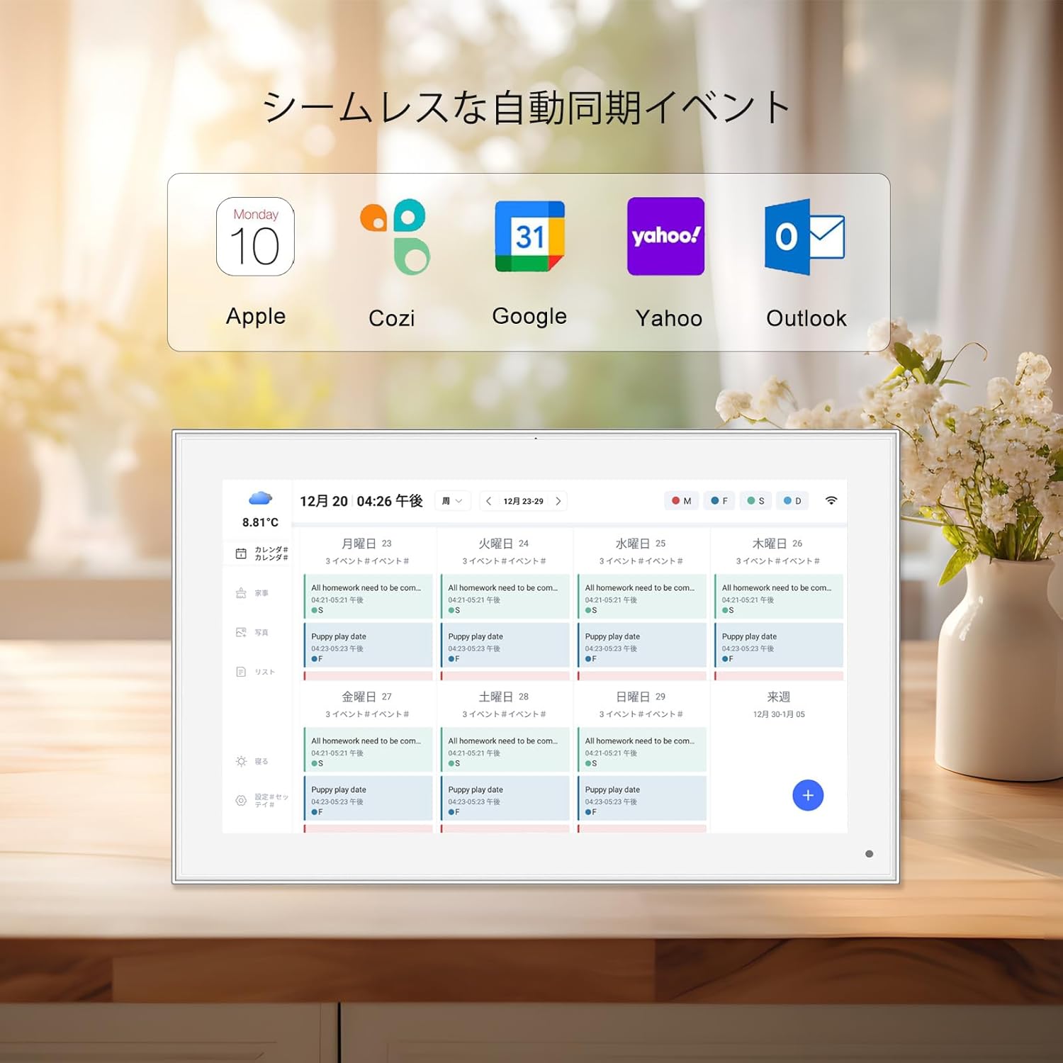
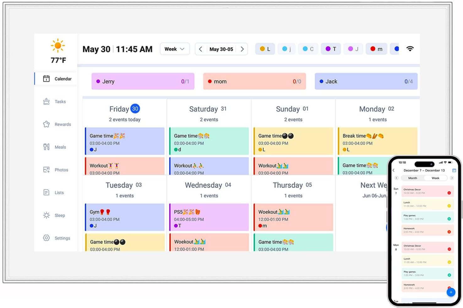
Even the best hardware can be let down by poor software. Android's display scaling ensures that apps, text, and icons look sharp on 1080p screens of different sizes. For example, a 10.1 inch tablet needs larger icons and text than a 7 inch tablet to remain readable, but not so large that they waste space. Manufacturers often tweak Android's scaling settings for their specific screen size, ensuring that 1080p content is neither too small nor too big. They also optimize pre-installed apps—like the calendar or photo viewer—to take advantage of the screen's dimensions. A well-optimized 10.1 inch digital calendar, for instance, will display dates in a grid that fills the screen without overlapping, making it easy to read at a glance.
To see size optimization in practice, let's look at three popular 10.1 inch 1080p Android devices and how their design caters to specific needs:
| Device Type | Key Features | Why 10.1 Inch 1080p Works | Target User |
|---|---|---|---|
| 10.1 inch android kids tablet pc | Durable build, parental controls, educational apps, 16:9 IPS screen, kid-friendly interface | Large enough for interactive games and videos (no squinting!) but light enough for kids to carry. 1080p ensures educational content (like math games or science videos) is clear and engaging. 16:9 ratio is perfect for cartoons and YouTube Kids. | Parents with children aged 3–10, looking for a device that's both fun and educational. |
| 10.1 inch digital calendar | Day/date display, weather updates, appointment reminders, 4:3 or 3:2 IPS screen, wall-mountable | Compact enough for a desk or kitchen counter, but large enough to show a full month view with details. 1080p makes text sharp—no more squinting at tiny dates. 4:3 ratio mimics a paper calendar, making it intuitive to use. | Busy professionals, seniors, or families who want a visual reminder of schedules and events. |
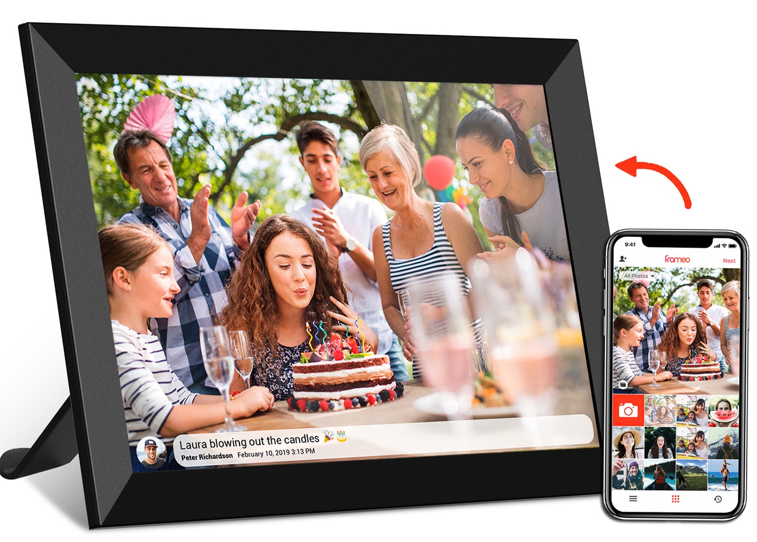
| 10.1 inch wireless wifi digital photo frame | Cloud photo sync (via apps like Frameo), touchscreen, 4:3 IPS screen, auto-rotate, 32GB storage | Small enough to place on a shelf or mantel, but large enough to display family photos in detail. 1080p ensures photos (even high-res shots from phones) look crisp, while 4:3 ratio avoids cropping standard prints. Wireless sync means grandparents can receive photos instantly from kids/grandkids. | Grandparents, families separated by distance, or anyone who wants to display photos without printing them. |
Each of these devices leverages 10.1 inch 1080p to solve a specific problem: keeping kids entertained and learning, helping users stay organized, and making it easy to share memories. By optimizing size, resolution, and features for their target audience, they deliver a user experience that feels tailored—not one-size-fits-all.
As technology evolves, so too will how we optimize 1080p tablet sizes. Here are a few trends to watch:
Foldable and rollable displays could one day allow tablets to change size on demand—small for portability, large for content consumption. Imagine a 10.1 inch tablet that unfolds to 15.6 inches when you want to watch a movie, then folds back down for travel. While still in early stages, this tech could redefine size optimization by letting users choose the perfect size for each task, all while keeping 1080p resolution sharp across different dimensions.
Artificial intelligence could soon optimize screen size and resolution based on what you're doing. For example, if you're reading an e-book, the tablet might adjust to a taller aspect ratio for more text per page; if you're gaming, it could switch to 16:9 for a wider view. AI could also learn your habits—like preferring a larger display in the evening for streaming—and adjust settings automatically, making size optimization more personalized than ever.
As eco-consciousness grows, manufacturers may prioritize smaller 1080p tablets that use less energy. A 10.1 inch tablet requires less battery than a 13.3 inch one, and smaller screens mean fewer materials in production. This aligns with the trend toward sustainability, proving that size optimization can also be environmentally friendly.
We'll likely see more specialized sizes tailored to niche users. For example, a 8 inch 1080p tablet for medical professionals (easy to carry during rounds), or a 12 inch 1080p tablet for artists (more space for drawing). These devices will balance resolution, size, and features to meet the unique needs of their audience, much like the 10.1 inch models do today for kids, families, and professionals.
At the end of the day, a 1080p Android tablet is only as good as its size optimization. It's the reason a 10.1 inch android kids tablet pc feels just right in a child's hands, why a 10.1 inch digital calendar makes your schedule easy to digest, and how a 10.1 inch wireless wifi digital photo frame turns family photos into a focal point in your home. By balancing resolution, physical dimensions, aspect ratio, and software, manufacturers create devices that don't just display content—they enhance how we interact with it.
Whether you're shopping for a tablet for your kid, upgrading your home office with a digital calendar, or looking to share photos with loved ones, remember: size matters. A well-optimized 1080p tablet will feel like it was designed just for you—portable when you need it, spacious when you want it, and always sharp, clear, and comfortable to use. So next time you're browsing tablets, don't just look at the resolution—look at how the size fits your life. That's the true mark of a great device.