So far, we've covered the "standards"—the common sizes and ratios that most off-the-shelf desktop tablets use. But industries often have unique needs that can't be met by a one-size-fits-all device. That's where customization comes in. From healthcare clinics needing durable, easy-to-clean tablets to retailers wanting branded digital displays, customization allows businesses to tailor every aspect of a desktop tablet—including size and ratio—to their specific goals. Let's break down the key points to consider when customizing.
1. Define the Use Case First
The most critical step in customization is clarifying how the device will be used. A
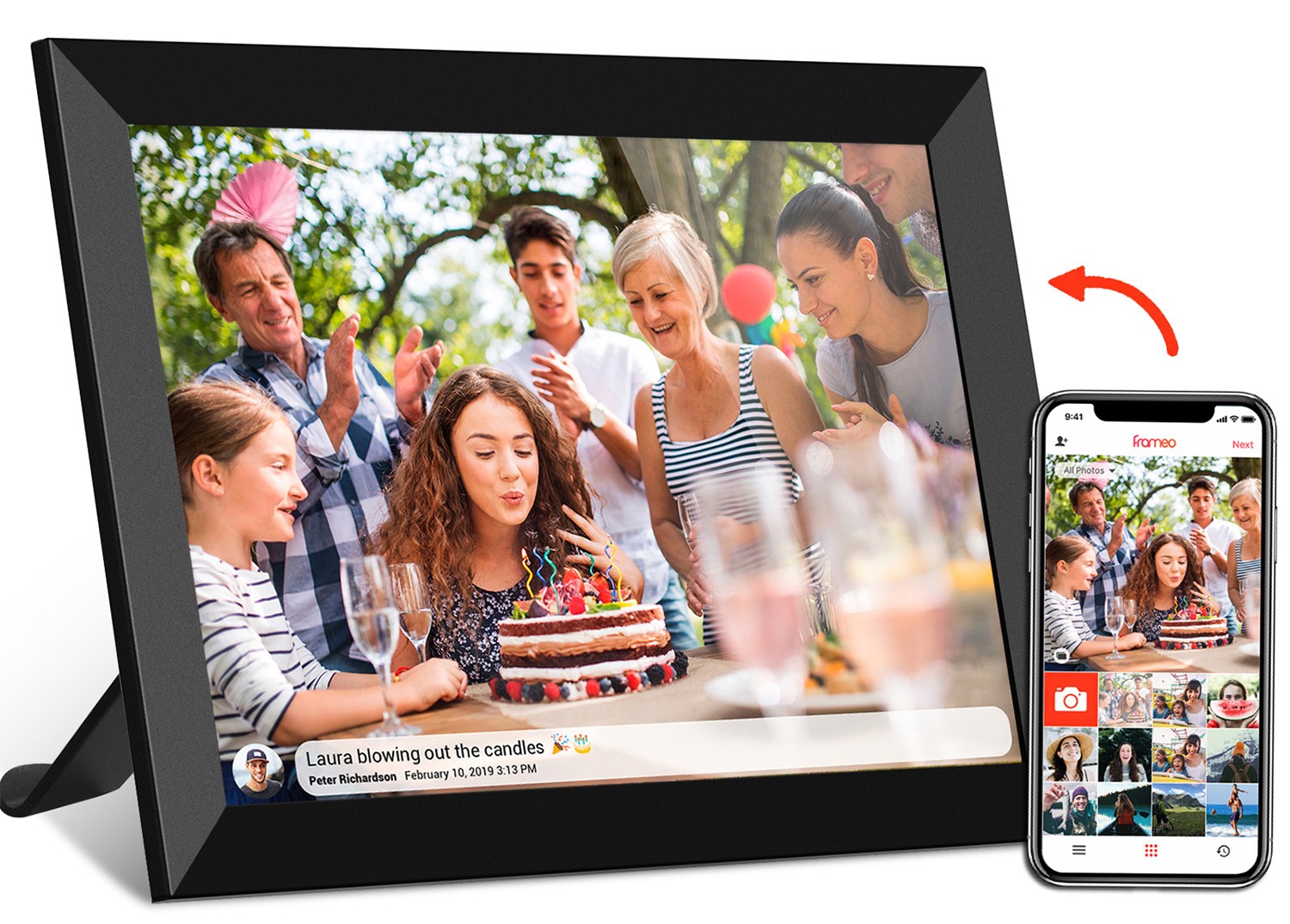
10.1 inch frameo wifi digital photo frame
designed for home use has very different requirements than a 21.5 inch medical tablet used in a hospital. For the photo frame, priorities might include a user-friendly app (like Frameo, which lets family members send photos remotely), a slim design, and enough storage (32GB is common) to hold hundreds of images. For the medical tablet, durability (waterproofing, scratch resistance), sanitizable materials, and security features (like HIPAA compliance) take precedence. The use case dictates everything from size and ratio to software and hardware add-ons.
2. Aspect Ratio: Align with Content
When customizing, never choose an aspect ratio in a vacuum—align it with the content that will be displayed. For example, a restaurant using a desktop tablet to showcase its menu would benefit from a 4:3 ratio, as menus are typically taller than they are wide, making it easier to list dishes without constant scrolling. A gym displaying workout videos, on the other hand, would opt for 16:9 to ensure videos play in full screen. Some businesses even mix ratios: a retail store might use 16:9 tablets near the entrance for promotional videos and 4:3 tablets by the checkout counter for product details.
3. Size vs. Space: Measure Twice, Order Once
It's easy to get excited about a large screen, but it's crucial to consider the physical space where the tablet will live. A
24 inch digital signage tablet might look impressive on paper, but if it's going into a small office lobby, it could overwhelm the room. Conversely, a 7 inch tablet might be too small for a conference room where people are sitting 10 feet away. The
desktop tablet l-type series
is a great example of space-conscious design—the L-shaped stand elevates the screen, saving desk space and keeping cables organized, making it popular in crowded offices. Always measure the intended location and test visibility from typical viewing distances before finalizing size.
4. Materials and Mounting: Durability and Aesthetics
Customization isn't just about the screen—it's also about the build. For high-traffic areas (like airports or shopping malls), tablets need to withstand bumps, spills, and constant use. This might mean opting for a metal frame instead of plastic, or a scratch-resistant glass screen. Mounting options are another key consideration: wall-mounted, desktop, or floor-standing? A
21.5 inch wifi digital photo frame
in a hotel lobby might be wall-mounted to save floor space, while a desktop L-type tablet in an office would use a stand for adjustability. Some industries even request custom colors or branding—like a company logo etched into the back of the tablet—to reinforce brand identity.
5. Software and Connectivity: Beyond the Hardware
A great screen is nothing without the right software to power it. Customization often includes pre-installing apps or modifying the operating system (OS) to fit specific needs. For example, a
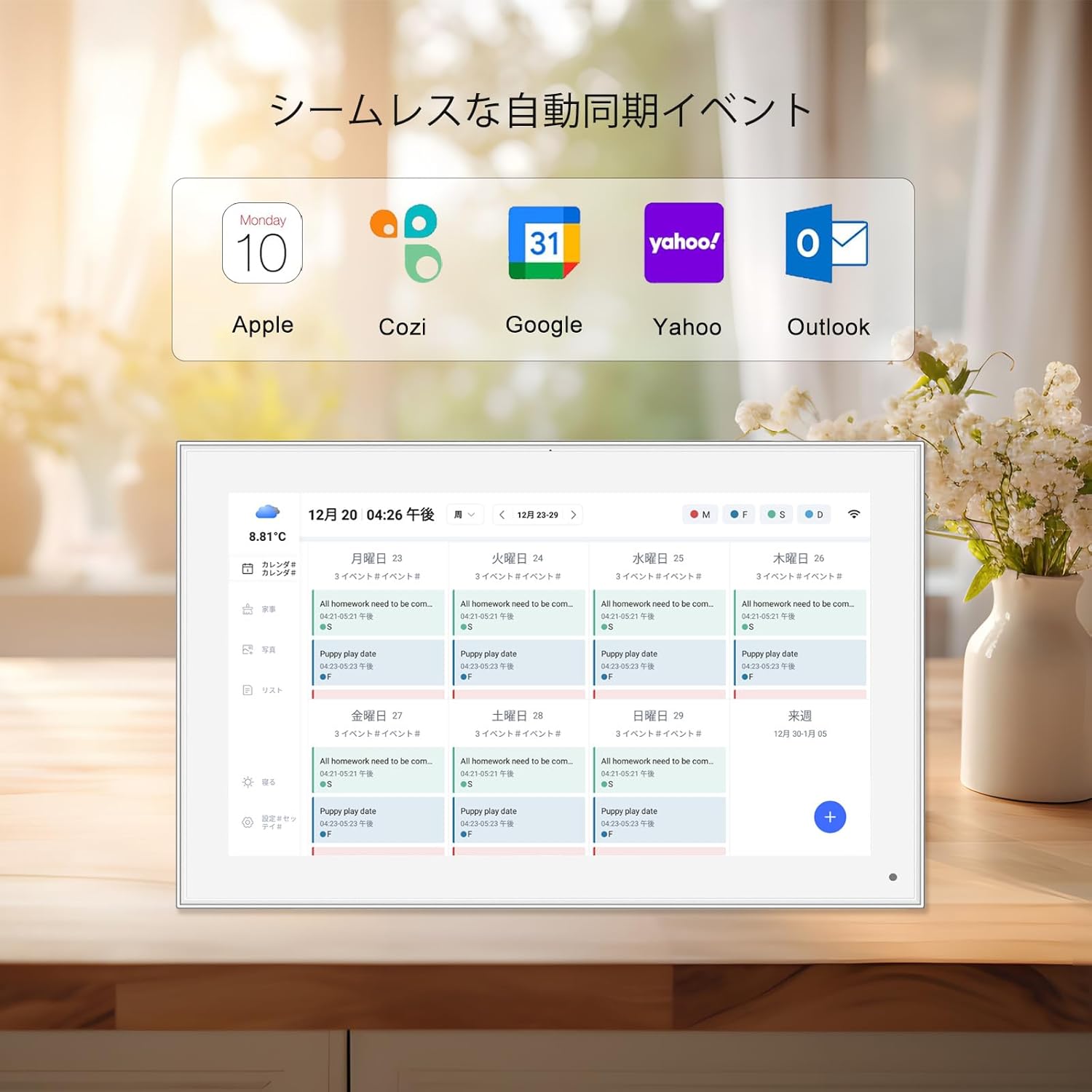
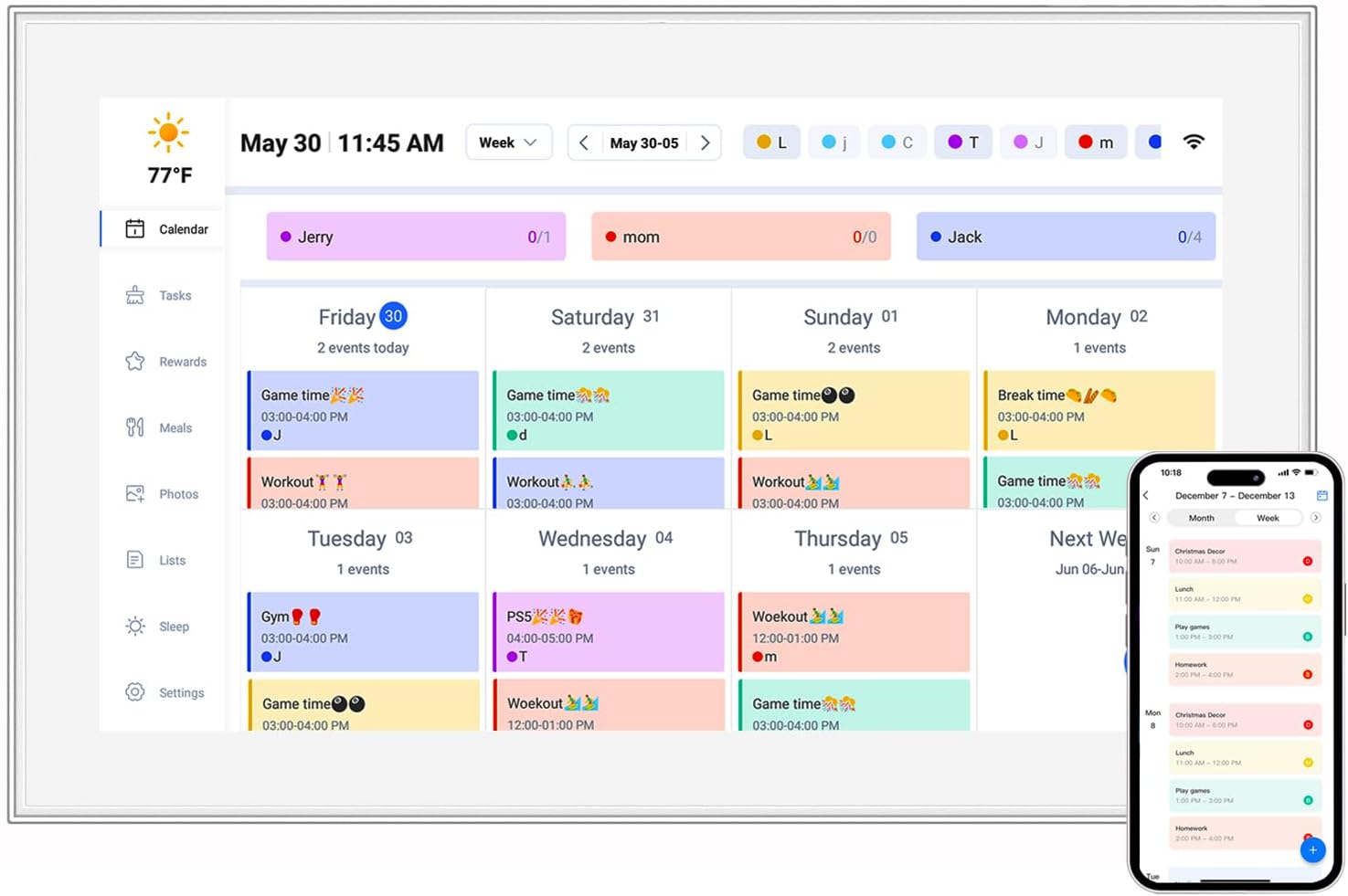
10.1 inch digital calendar
might come with a dedicated app that syncs with Google Calendar or Outlook, displaying appointments in a user-friendly format. Frameo-enabled photo frames include the Frameo app, which uses Wi-Fi to let users send photos directly to the frame from their phones. Connectivity options are also customizable: some tablets include PoE (Power over Ethernet) for easy installation in commercial settings, while others prioritize Wi-Fi and Bluetooth for flexibility. The goal is to make the device as "plug-and-play" as possible for the end user.