In the world of portable display technology, size isn't just a number—it's a silent architect of user experience. Whether you're designing a device for a child learning through a tablet, a professional juggling spreadsheets on the go, or a family sharing memories on a digital photo frame, the dimensions of the display can make or break how well the product resonates with its audience. It's not about picking the biggest or smallest screen available; it's about finding that sweet spot where functionality, usability, and context collide. Let's dive into why size matters so much in portable display program development, explore the key factors that influence size decisions, and look at real-world examples that highlight how the right (or wrong) size can shape a product's success.
When developers and product managers sit down to design a portable display, the first question often isn't "how big?" but "who is this for?" and "where will it live?" A 24.5 inch portable monitor, for instance, might be perfect for a graphic designer who needs extra screen space while working from a coffee shop, but it would be wildly impractical for a child trying to carry a tablet to school. Similarly, a 10.1 inch LED digital photo frame fits neatly on a mantel or desk, but a 21.5 inch version might overwhelm a small living room—unless the goal is to turn a wall into a dynamic art piece. Size dictates everything from how the device is held or placed, to how much battery it consumes, to how clearly content (whether photos, videos, or spreadsheets) is visible. In short, size is the foundation upon which all other user experience elements are built.
Choosing the right size for a portable display involves balancing multiple, often competing, priorities. Let's break down the most critical factors that guide these decisions:
Age, hand size, and physical ability play huge roles. Consider a kids tablet: a 7-inch or 10.1-inch screen is typically ideal because it's small enough for little hands to grip comfortably, reducing the risk of drops. A larger screen would be unwieldy, and a smaller one might make interactive games or educational apps hard to navigate. On the flip side, a healthcare professional using a medical tablet needs a screen large enough to read patient records or view diagnostic images clearly—often 10.1 inches or larger—without being so bulky that it's cumbersome to carry between exam rooms.
A display's purpose dictates its ideal size. Take portable monitors: a 13.3-inch model might suit a student who needs a secondary screen for note-taking, while a 24.5-inch portable monitor is better for professionals like video editors or programmers who require extensive screen real estate to multitask. For digital signage, context is everything: a floor-standing digital signage unit in a mall might be 43 inches to grab attention from afar, but a desktop tablet L-type series for a meeting room could be 10.1 inches—small enough to save space but large enough for a team to view agendas or presentations.
As screen size increases, so do demands on battery life, weight, and resolution. A larger display requires more power to light up, which can drain batteries faster—a critical concern for portable devices like kids tablets or portable monitors. Weight also becomes an issue: a 24.5-inch monitor might offer a stunning view, but if it weighs 5 pounds, it's no longer "portable" for daily commuting. Resolution must scale too; a 21.5-inch digital photo frame with a low resolution will look pixelated, defeating the purpose of displaying high-quality images. Developers must also consider aspect ratios: a 19-inch 4:3 screen digital photo frame is better for classic photos, while a 16:9 24.5-inch portable monitor aligns with modern video and productivity needs.
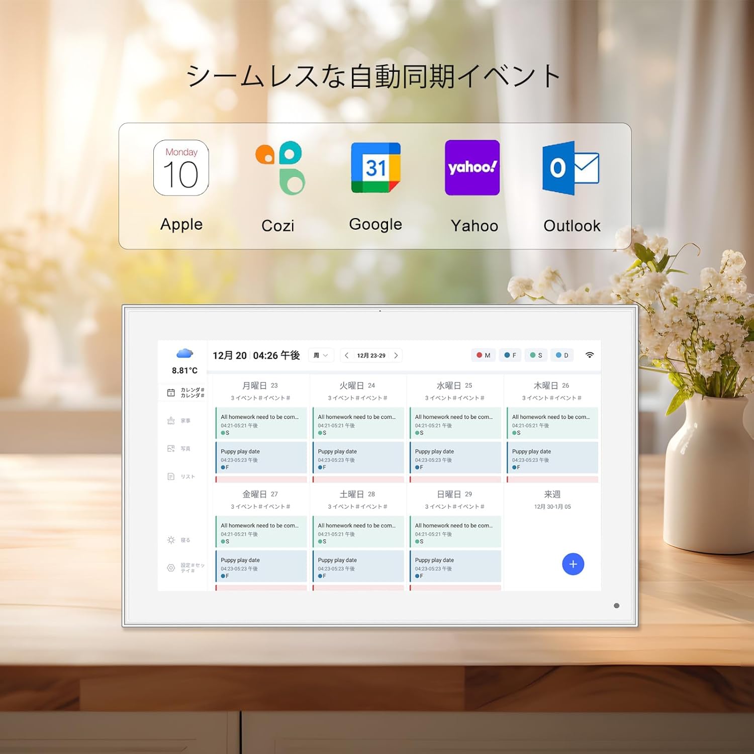
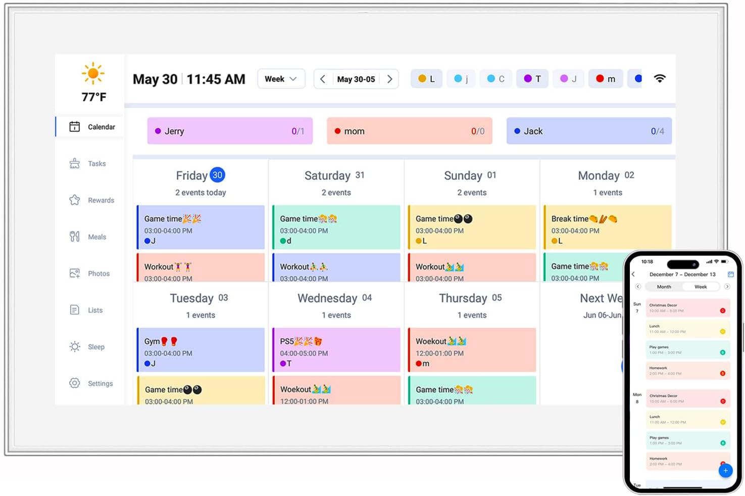
Where the device lives matters as much as who uses it. A 15.6-inch digital calendar might work in a spacious kitchen, but a 10.1-inch version is more practical for a cramped home office. In healthcare settings, an 10.1-inch healthcare android tablet needs to fit on a hospital cart or beside a patient bed without taking up too much space, while still being readable for nurses and doctors. Even projectors, like the hy300 ultra projector, must balance portability with throw distance—the size of the projected image depends on how far the device is from the wall, making it a flexible but context-dependent solution for large displays.
While there's no universal "perfect size," certain ranges have emerged as sweet spots for different product types. Let's explore these categories, along with examples that illustrate why these sizes work—and when to deviate from them.
| Size Range | Primary Use Cases | Key Products & Examples | Design Considerations |
|---|---|---|---|
| 7–10.1 inches | Kids tablets, digital photo frames, medical tablets, small digital signage | 10.1 inch LED digital photo frame, kids tablet (10.1 inch kids tablet pc), 10.1 inch healthcare android tablet | Lightweight (under 1.5 lbs), easy to grip, battery life (6+ hours), child-safe materials (for kids tablets) |
| 13–15.6 inches | Portable monitors (secondary screens), digital calendars, video brochures | 15.6 inch digital calendar, 13.3 inch portable monitor, 10.1inch video brochure | Balanced weight (2–3 lbs), Full HD resolution, slim profile, USB-C connectivity |
| 19–24.5 inches | Primary portable monitors, large digital photo frames, desktop signage | 24.5 inch portable monitor, 21.5 inch wifi digital photo frame, 19 inch wifi digital photo frame (4:3 screen) | Higher resolution (QHD/4K), sturdy stand, built-in speakers, longer battery life or AC power |
| 32+ inches (projectors & large signage) | Home theater, conference rooms, retail displays | hy300 ultra projector, 43 inch commercial digital signage, incell portable smart tv (32 inch) | Brightness (lumens), throw distance, portability (for projectors), weather resistance (outdoor signage) |
To understand the real-world impact of size, let's look at specific products and why their dimensions work (or could be improved).
Kids tablets are a prime example of size tailored to user needs. A 10.1-inch screen strikes a balance between usability and portability for children aged 4–12. It's large enough to display educational apps, videos, and games without straining young eyes, yet small enough for little hands to hold comfortably for extended periods. Manufacturers like SSA and Uhale often opt for this size because it's versatile: it fits in backpacks, works with kid-sized styluses, and can include features like parental controls and durable, shock-resistant casing without adding excessive weight. A smaller screen (7 inches) might be too cramped for interactive learning tools, while a 13-inch model would be too heavy for a child to carry, leading to dropped devices and frustrated users. The 10.1-inch sweet spot has made it a staple in the kids tablet market, proving that size here is as much about safety and comfort as it is about screen real estate.
For professionals who work on the go—think designers, developers, or remote workers—a portable monitor is a game-changer, and size matters deeply here. The 24.5-inch portable monitor has emerged as a favorite among power users for one key reason: it delivers desktop-level screen space in a form factor that's (relatively) easy to transport. Unlike smaller 13-inch models, which feel like an extension of a laptop, a 24.5-inch monitor allows users to run multiple apps side by side, edit 4K videos, or code with multiple windows open—all without sacrificing portability. Brands like HY300 Pro+ have capitalized on this by equipping their 24.5-inch monitors with features like IPS panels for wide viewing angles, USB-C connectivity for plug-and-play setup, and slim bezels to maximize screen area. The tradeoff? Weight (around 3–4 lbs) and the need for external power, but for users who prioritize productivity, the size-to-functionality ratio is unbeatable. It's a reminder that "portable" doesn't always mean "tiny"—it means "fit for the user's lifestyle."
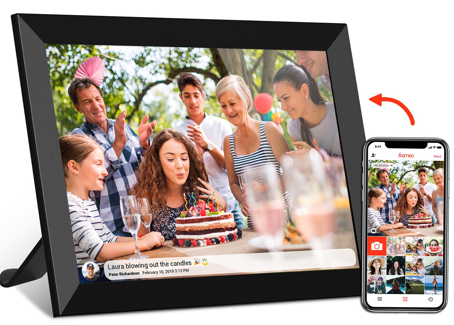
Digital photo frames have evolved from novelty gadgets to must-have home tech, and their size has adapted to fit modern living spaces. The 10.1 inch LED digital photo frame is a popular choice because it balances visibility with versatility. It's large enough to display family photos in crisp detail (especially with LED backlighting for vibrant colors) but small enough to sit on a bookshelf, mantel, or desk without dominating the room. Unlike larger 21.5-inch models, which require dedicated wall space, a 10.1-inch frame can blend into any decor—whether in a minimalist apartment or a busy family home. Features like Frameo cloud connectivity (allowing remote photo sharing) and touchscreens (as in the 21.5 inch wifi digital picture frame frameo with touch) enhance usability, but the size remains the foundation. A 7-inch frame might be too small for group viewing, while a 15-inch model could feel cluttered in a small living room. The 10.1-inch size hits the sweet spot, making it a go-to for brands targeting the mainstream home market.
When "bigger is better" but portability is still key, projectors like the hy300 ultra projector offer a unique solution. Unlike fixed-size displays, projectors create images that can scale from 50 inches to over 100 inches, depending on the room. The hy300 ultra, a compact model, weighs just over 2 lbs and fits in a backpack, making it ideal for movie nights, outdoor gatherings, or impromptu presentations. Its size as a device (small enough to hold in one hand) belies its display capability, proving that size isn't just about the screen—it's about the technology that creates it. While projectors can't replace the clarity of a direct-view monitor in bright rooms, they excel in scenarios where a large, temporary display is needed. This flexibility has made them popular for both personal and professional use, showing that sometimes the "right size" is no size at all—just the ability to adapt.
As display technology advances, the rules of "applicable size" are being rewritten. Foldable and rollable displays, for example, allow a 7-inch tablet to expand into a 13-inch monitor, blending portability and screen space. Micro-LED technology is making smaller displays brighter and more energy-efficient, meaning even a 10.1-inch digital photo frame could soon rival the clarity of a 24-inch model. For kids tablets, we might see modular designs—smaller base units with attachable screen extenders for older children. Projectors like the hy300 ultra are also getting smarter, with auto-focus and keystone correction, making them easier to use in any space. The future isn't about picking a single size; it's about creating displays that adapt to users' needs in real time.
At the end of the day, the applicable size for a portable display isn't just a number on a spec sheet—it's a reflection of who we are, how we live, and what we value. A 10.1-inch kids tablet speaks to the importance of learning through play, designed to fit small hands and curious minds. A 24.5-inch portable monitor tells the story of modern work, where flexibility and productivity go hand in hand. A 10.1-inch digital photo frame preserves memories, sized to fit into the rhythm of daily life without overwhelming it. And a projector like the hy300 ultra embodies the joy of shared experiences, proving that the best displays are the ones that bring people together—no matter the size.
For developers and product creators, the lesson is clear: start with the user. Ask not "how big can we make it?" but "how can size make this product feel like it was designed *for* them?" When you get that right, the size fades into the background—and the experience takes center stage. After all, the best technology is the kind that fits so seamlessly into our lives, we barely notice it's there—until we can't imagine living without it.